ForwardWidgets
Widgets for Douban and Trakt watchlists plus personalized recommendations, live TV streaming including PlutoTV, Yatu ra…
JavaScript★ 247
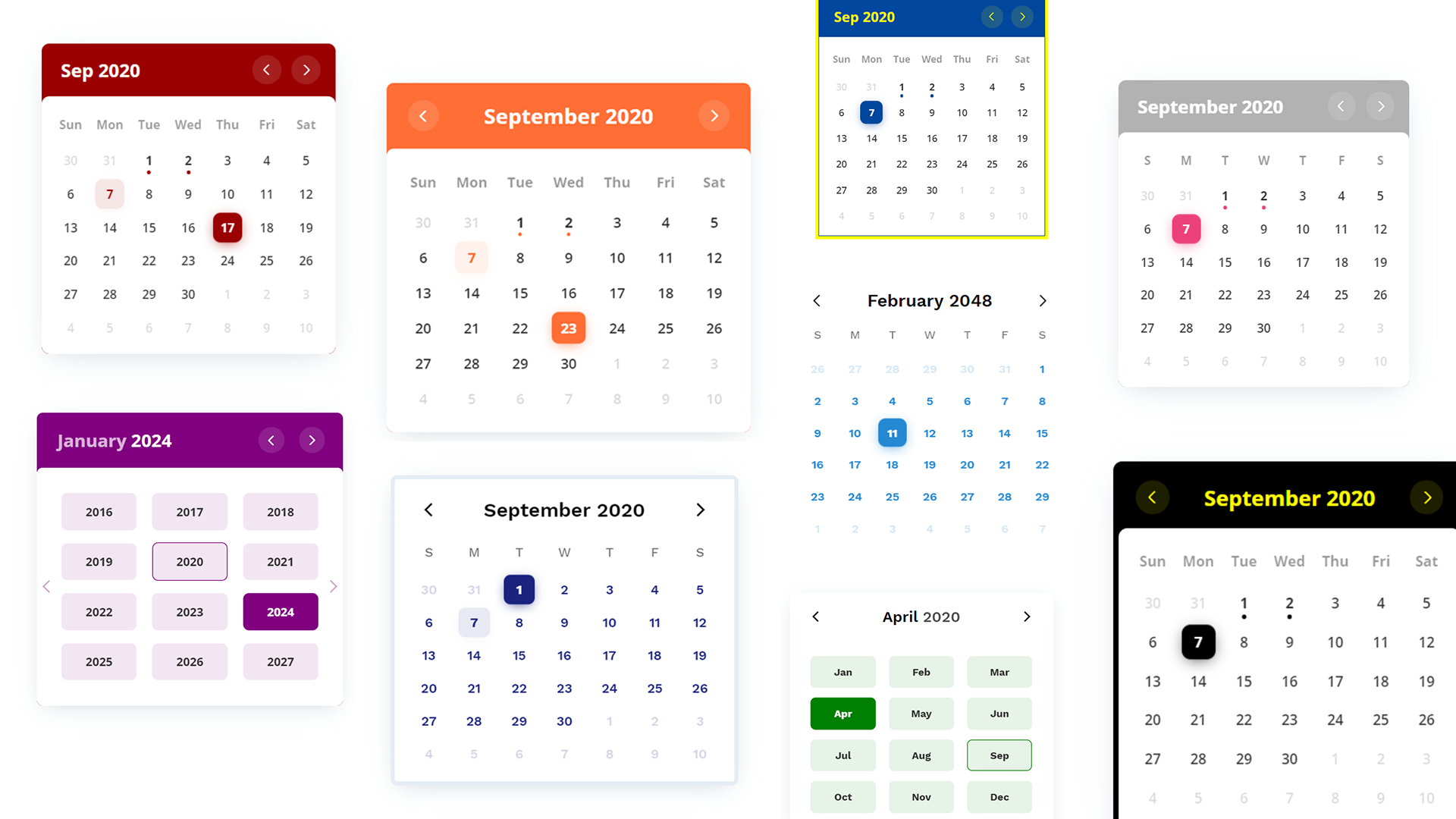
📅 A customizable calendar JavaScript UI widget/component library with the ability to show events.
 PawanKolhe
Add a colorful, interactive events calendar to your site in seconds. Try it: Storybook | CodeSandbox
⚛️ React wrapper available
You might need to use a module bundler such as webpack, rollup, parcel, etc.
npm i color-calendar
import Calendar from "color-calendar";
import "color-calendar/dist/css/theme-<THEME-NAME>.css";
Check the themes section for available themes.
<script src="https://cdn.jsdelivr.net/npm/color-calendar@3.0.0/dist/bundle.js">
Also available on unpkg.
Pick a css file according to the theme you want.
<link
  rel="stylesheet"
  href="https://cdn.jsdelivr.net/npm/color-calendar@3.0.0/dist/css/theme-basic.css"
/>
<!-- or -->
<link
  rel="stylesheet"
  href="https://cdn.jsdelivr.net/npm/color-calendar@3.0.0/dist/css/theme-glass.css"
/>
Get fonts from Google Fonts
<link
  href="https://fonts.googleapis.com/css2?family=Open+Sans:wght@400;600;700&display=swap"
  rel="stylesheet"
/>
Check what fonts the theme needs or pass your own fonts in options.
new Calendar();
Or you can pass in options.
new Calendar({
  container: "#color-calendar",
  calendarSize: "small",
  initialSelectedDate: new Date(2024, 5, 15) // June 15, 2024
});
<div id="color-calendar"></div>
// Using a function that returns an HTMLElement
new Calendar({
  container: () => document.getElementById("my-calendar")
});

// Dynamic element creation
new Calendar({
  container: () => {
    const container = document.createElement("div");
    document.body.appendChild(container);
    return container;
  }
});

// Using HTMLElement directly
const myElement = document.getElementById("my-calendar");
new Calendar({
  container: myElement
});
new Calendar({
  container: "#calendar",
  eventBulletMode: "multiple", // or "single"
  eventsData: [
    {
      start: '2024-09-15T00:00:00',
      end: '2024-09-20T23:59:59',
      name: 'Red Event',
      color: '#ff0000'
    },
    {
      start: '2024-09-15T00:00:00',
      end: '2024-09-15T23:59:59',
      name: 'Blue Event',
      color: '#0000ff'
    },
    {
      start: '2024-09-24T00:00:00',
      end: '2024-10-05T23:59:59',
      name: 'Cross-Month Event',
      color: '#00ff00'
    }
  ]
});
Color Calendar includes a dedicated React wrapper component with full TypeScript support:
import React, { useState } from 'react';
import { ColorCalendar } from 'color-calendar/react';

function App() {
  const [selectedDate, setSelectedDate] = useState(new Date());

  return (
    <ColorCalendar
      calendarSize="large"
      theme="basic"
      selectedDate={selectedDate}
      onSelectedDateChange={(date, events) => {
        console.log('Selected date:', date);
        console.log('Events:', events);
        setSelectedDate(date);
      }}
    />
  );
}
Key Features:
selectedDate prop for controlled date selectioncontainerType: String | HTMLElement | Function
Default: #color-calendar
Selector referencing HTMLElement where the calendar instance will bind to.
String: CSS selector string (e.g., "#my-calendar", ".calendar-container")
HTMLElement: Direct reference to an HTMLElement
Function: Function that returns an HTMLElement or null
// Function-based container example
const calendar = new ColorCalendar({
  container: () => document.getElementById("my-calendar"),
  // ... other options
});

// Dynamic element creation
const calendar = new ColorCalendar({
  container: () => {
    let container = document.getElementById("calendar-container");
    if (!container) {
      container = document.createElement("div");
      container.id = "calendar-container";
      document.body.appendChild(container);
    }
    return container;
  },
  // ... other options
});

// Using HTMLElement directly
const myElement = document.getElementById("my-calendar");
const calendar = new ColorCalendar({
  container: myElement,
  // ... other options
});
initialSelectedDateType: Date | null
Default: undefined (uses current date)
Sets the initial selected date when the calendar is first rendered. The calendar will open with this date selected and the view will be set to the month containing this date.
undefined: Defaults to today's dateDate: Sets the specified date as selectednull: No date is selected initially (calendar shows current month but no day is highlighted)// Default behavior - selects today's date
new Calendar({
container: "#calendar"
});
// Select a specific date
new Calendar({
container: "#calendar",
initialSelectedDate: new Date(2024, 5, 15) // June 15, 2024
});
// No initial selection
new Calendar({
container: "#calendar",
initialSelectedDate: null // No date selected
});
calendarSizeType: String
Default: large
Options: small | large
Size of calendar UI.
layoutModifiersType: LayoutModifier[]
Default: []
Example: ['month-left-align']
Modifiers to alter the layout of the calendar.
eventsDataType: EventData[]
Default: []
[
    {
        start: '2020-08-17T06:00:00',
        end: '2020-08-18T20:30:00',
        name: 'Blockchain 101',
        color: '#ff0000'
      ...
    },
    ...
]
Array of objects containing events information.
Note: Properties
startandendare required for each event in the ISO 8601 date and time format. You can optionally choose to add other properties.
themeType: String
Default: basic
Options: basic | glass
Choose from available themes.
primaryColorType: String
Default: based on theme
Example: #1a237e
Main color accent of calendar. Pick a color in rgb, hex or hsl format.
headerColorType: String
Default: based on theme
Example: rgb(0, 102, 0)
Color of header text.
headerBackgroundColorType: String
Default: based on theme
Example: black
Background color of header. Only works on some themes.
weekdaysColorType: String
Default: based on theme
Color of weekdays text. Only works on some themes.
weekdayDisplayTypeType: String
Default: long-lower
Options: WeekdayDisplayType (short | long-lower | long-upper)
Select how weekdays will be displayed. E.g. M, Mon, or MON.
monthDisplayTypeType: String
Default: long
Options: MonthDisplayType (short | long)
Select how month will be displayed in header. E.g. Feb, February.
startWeekdayType: Number
Default: 0
Options: 0 | 1 | 2 | 3 | 4 | 5 | 6
Starting weekday. Mapping: 0 (Sun), 1 (Mon), 2 (Tues), 3 (Wed), 4 (Thurs), 5 (Fri), 6 (Sat)
fontFamilyHeaderType: String
Default: based on theme
Example value: 'Open Sans', sans-serif
Font of calendar header text.
fontFamilyWeekdaysType: String
Default: based on theme
Font of calendar weekdays text.
fontFamilyBodyType: String
Default: based on theme
Font of calendar days as well as month and year picker text.
dropShadowType: String
Default: based on theme
Set CSS of calendar drop shadow.
borderType: String
Default: based on theme
Example value: 5px solid black
Set CSS style of border.
borderRadiusType: String
Default: 0.5rem
Set CSS border radius of calendar.
disableMonthYearPickersType: Boolean
Default: false
If month and year picker should be disabled.
disableDayClickType: Boolean
Default: false
If day click should be disabled.
disableMonthArrowClickType: Boolean
Default: false
If month arrows should be disabled.
customMonthValuesType: String[]
Default: undefined
Set custom display values for Month.
customWeekdayValuesType: String[]
Default: undefined
Set custom display values for Weekdays.
["Lun", "Mar", "Mer", "Jeu", "Ven", "Sam", "Dim"];
eventBulletModeType: String
Default: multiple
Options: multiple | single
Controls how event bullets are displayed when multiple events exist on the same day.
multiple: Shows one bullet per event, positioned side by side (maximum 5 bullets to prevent overflow)single: Shows only one bullet per day, using the first event's colornew Calendar({
container: "#calendar",
eventBulletMode: "single", // or "multiple"
eventsData: [
{
start: '2024-09-15T00:00:00',
end: '2024-09-15T23:59:59',
name: 'Red Event',
color: '#ff0000'
},
{
start: '2024-09-15T00:00:00',
end: '2024-09-15T23:59:59',
name: 'Blue Event',
color: '#0000ff'
}
]
});
onSelectedDateChangeType: Function
Props:
currentDate
DatefilteredDateEvents
EventData[]const options = {
...
onSelectedDateChange: (currentDate?: Date, filteredDateEvents?: EventData[]) => {
// do something
};
...
}
Emitted when the selected date is changed.
onSelectedDateClickType: Function
Props:
currentDate
DatefilteredMonthEvents
EventData[]Emitted when the selected date is clicked.
onMonthChangeType: Function
Props:
currentDate
DatefilteredMonthEvents
EventData[]Emitted when the current month is changed.
reset()Reset calendar to today's date.
// Example
let myCal = new Calendar();
myCal.reset();
setSelectedDate()Props:
| Props | Type | Required | Description |
|---|---|---|---|
| date | Date | null | required | New date to be set, or null to clear selection |
Set new selected date or clear selection.
// Set a specific date
myCal.setSelectedDate(new Date());

// Clear selection (no date selected)
myCal.setSelectedDate(null);
getSelectedDate()Return:
Date | nullCurrently selected date, or null if no date is selectedGet currently selected date. Returns null if no date is currently selected.
getEventsData()Return:
All eventsGet events array.
setEventsData()Props:
| Props | Type | Required | Description |
|---|---|---|---|
| events | EventData[] | required | Events to be set |
Return:
NumberNumber of events setSet a new events array.
addEventsData()Props:
| Props | Type | Required | Description |
|---|---|---|---|
| events | EventData[] | required | Events to be added |
Return:
NumberNumber of events addedAdd events of the events array.
setWeekdayDisplayType()Props:
| Props | Type | Required | Description |
|---|---|---|---|
| weekdayDisplayType | WeekdayDisplayType | required | New weekday type |
Set weekdays display type.
// Example
myCal.setWeekdayDisplayType("short");
setMonthDisplayType()Props:
| Props | Type | Required | Description |
|---|---|---|---|
| monthDisplayType | MonthDisplayType | required | New month display type |
Set month display type.
EventData{
start: string, // ISO 8601 date and time format
end: string, // ISO 8601 date and time format
color?: string, // Optional color for event bullet (hex, rgb, hsl)
[key: string]: any,
}
Properties:
start (required): Event start date in ISO 8601 formatend (required): Event end date in ISO 8601 formatcolor (optional): Color for the event bullet. Accepts any valid CSS color value (hex, rgb, hsl, etc.). Falls back to primaryColor if not specified.WeekdayDisplayType"short" | "long-lower" | "long-upper"
// "short"
M T W ...

// "long-lower"
Mon Tue Wed ...

// "long-upper"
MON TUE WED ...
MonthDisplayType"short" | "long"
// "short"
Jan Feb Mar ...

// "long"
January February March ...
LayoutModifier"month-align-left"
EventBulletMode"multiple" | "single"
Controls how event bullets are displayed when multiple events exist on the same day.
"multiple": Shows one bullet per event, positioned side by side"single": Shows only one bullet per day, using the first event's colorCurrently 2 themes available. More on the way.
basic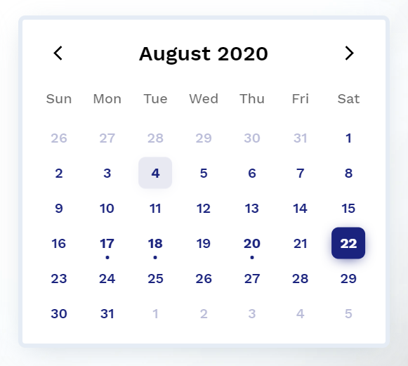
--cal-color-primary: #000000;
--cal-font-family-header: "Work Sans", sans-serif;
--cal-font-family-weekdays: "Work Sans", sans-serif;
--cal-font-family-body: "Work Sans", sans-serif;
--cal-drop-shadow: 0 7px 30px -10px rgba(150, 170, 180, 0.5);
--cal-border: none;
--cal-border-radius: 0.5rem;
--cal-header-color: black;
--cal-weekdays-color: black;
glass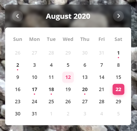
--cal-color-primary: #EC407A;
--cal-font-family-header: 'Open Sans', sans-serif;
--cal-font-family-weekdays: 'Open Sans', sans-serif;
--cal-font-family-body: 'Open Sans', sans-serif;
--cal-drop-shadow: 0 7px 30px -10px rgba(150, 170, 180, 0.5);
--cal-border: none;
--cal-border-radius: 0.5rem;
--cal-header-color: white;
--cal-header-background-color: rgba(0, 0, 0, 0.3);
Feel free to open an issue on GitHub if you find any bug.
Check here for release notes.
This software is open source, licensed under the MIT License.
more like this
Widgets for Douban and Trakt watchlists plus personalized recommendations, live TV streaming including PlutoTV, Yatu ra…
Firefox and Chrome extensions to prevent Google from making links ugly.
search projects, people, and tags