ForwardWidgets
Widgets for Douban and Trakt watchlists plus personalized recommendations, live TV streaming including PlutoTV, Yatu ra…
JavaScript★ 247
Gesture-driven, virtualized month / week / day calendar and date picker for React Native and the web.
 afonsojramos
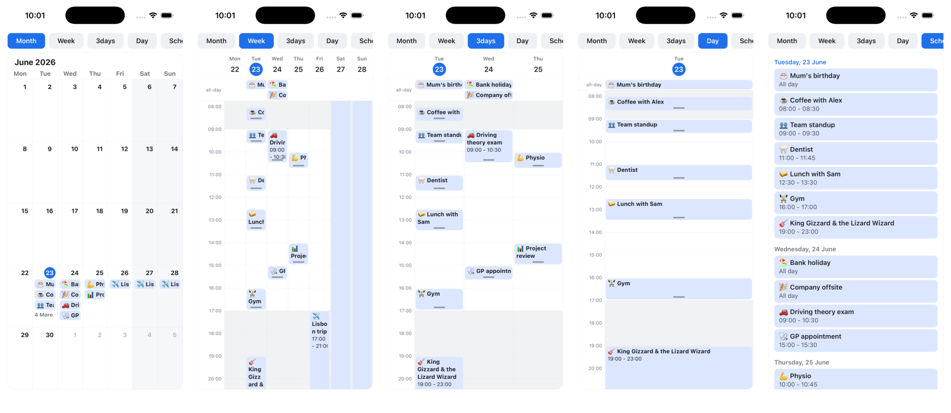
git clone https://github.com/afonsojramos/super-calendar.gitafonsojramos/super-calendarA generic, themeable month / week / day calendar for React Native.
Documentation · Quickstart · Live demo · API reference
@legendapp/listCalendarEvent<T>) and a renderEvent escape hatchuseDateRange), disabled days, and a scrolling MonthListuseMonthGrid hook to build a fully custom calendarThis is a ground-up reimagining inspired by the excellent
react-native-big-calendar.
It keeps the familiar month/week/day model but is built around Reanimated and
modern list virtualization — trading framework-agnosticism for a richer,
gesture-driven experience. It's not a fork; the API differs, and the name is
an homage. 🙇
Already using react-native-big-calendar? The migration guide has a copy-paste prompt for your coding agent plus a manual prop mapping.
| Capability | super-calendar | react-native-big-calendar |
|---|---|---|
| Month / week / day / 3-day / custom / agenda | ✅ | ✅ |
Generic event typing (CalendarEvent<T>) |
✅ | ✅ |
| Virtualized, snap-paged views | ✅ | ❌ renders all dates |
| Pinch-to-zoom (native) / Ctrl-scroll (web) | ✅ | ❌ |
| Drag to move & resize events | ✅ | ❌ (declined upstream) |
| Date selection (single / range / multiple) | ✅ useDateRange + disabled days |
❌ |
Headless grid hook (useMonthGrid) |
✅ | ❌ |
| Overlapping events | ✅ side-by-side columns | ⚠️ stacked / indented |
Month paging fires onChangeDate |
✅ | ⚠️ known gaps |
| Recurring events | ✅ expandRecurringEvents |
❌ expand them yourself |
| Time-zone display | ✅ eventsInTimeZone |
❌ |
| Dark mode | ✅ darkTheme preset |
❌ bring your own palette |
renderEvent across every mode & event type |
✅ | ⚠️ breaks for all-day/multi-day |
| Web | ✅ arrow-key paging, Ctrl-scroll zoom | ⚠️ partial |
| Runtime dependencies | Reanimated + Gesture Handler + Legend List | dayjs + calendarize (lighter) |
Legend: ✅ supported · ⚠️ partial or with known issues · ❌ not available. The last row is the honest trade-off: big-calendar has a smaller footprint and fewer native peers, so it can be the simpler choice when you don't need the gestures, virtualization, or the helpers above.
What it adds over react-native-big-calendar
@legendapp/list) — swipe across
years of dates, with native one-page paging (or opt into freeSwipe).CalendarEvent<T> carries your
own fields, and renderEvent is a component (so it may use hooks) that receives
the event box's live pixel height for progressive disclosure as the grid zooms.Feature parity. It also covers the rest of react-native-big-calendar's
surface: month / day / 3-day / week / custom N-day (and weekEndsOn
partial-weeks) / agenda (schedule) modes, all-day events (lane +
allDay flag, toggle the lane with showAllDayEventCell), multi-day clipping,
minHour/maxHour, ampm (hour axis and event times), showTime, timeslots,
hideHours, showWeekNumber, weekNumberPrefix, hourComponent,
sortedMonthView, moreLabel, showAdjacentMonths, showSixWeeks,
disableMonthEventCellPress, a default month weekday header
(renderHeaderForMonthView), a custom month date badge
(renderCustomDateForMonth), activeDate, per-event
disabled, onPress/onLongPress for events, cells and date headers,
onChangeDateRange, resetPageOnPressCell, swipeEnabled,
verticalScrollEnabled, showVerticalScrollIndicator, an agenda
itemSeparatorComponent, eventCellStyle, calendarCellStyle, a
headerComponent slot, date-fns locale, right-to-left column order (isRTL),
and theming. Text styling that big-calendar exposes via calendarCellTextStyle
is covered by CalendarTheme.text; overlapping events are laid out in
side-by-side columns automatically.
Trade-offs (where react-native-big-calendar may suit you better)
@legendapp/list are required. react-native-big-calendar is more
self-contained (no Reanimated/Gesture Handler).isRTL reverses the day-column order, like
big-calendar's): the hour gutter stays on the left and paging follows the
system scroll direction. Enable React Native's I18nManager for full RTL.The date-picker surface (MonthList, useDateRange, and the headless
useMonthGrid) is inspired by
flash-calendar, an excellent
headless date picker for React Native. If you only need date selection,
flash-calendar is the lighter, more focused choice: a dedicated, FlashList-based
picker with no event model. super-calendar folds picking into a
full gesture calendar, so one library covers events and date selection, at the
cost of the Reanimated, Gesture Handler, and Legend List peers. Pick
flash-calendar for a standalone picker; pick this when you also need the event
views.
npm install @super-calendar/native
Also published on JSR: deno add jsr:@super-calendar/native (or npx jsr add @super-calendar/native).
The full calendar relies on the following being installed in your app:
npm install react-native-reanimated react-native-worklets react-native-gesture-handler @legendapp/list date-fns
Make sure Reanimated and Gesture Handler are set up per their own docs (Babel
plugin, GestureHandlerRootView at the root of your app).
These are declared as optional peers so web-only installs (@super-calendar/dom)
and the picker (the @super-calendar/native/picker subpath) aren't asked to
install React Native packages they don't use. The full calendar still needs them:
because its components import Reanimated
and Gesture Handler directly, a missing one surfaces as a clear Metro
Unable to resolve "react-native-reanimated" build error rather than a silent
failure, so install the line above when you use Calendar or the time grid.
If you only need date selection, import it from the
@super-calendar/native/picker subpath. It contains the month grid,
selection, and the headless useMonthGrid, with none of the timetable code and
no Reanimated dependency, so it works on every bundler (Metro included) without
shipping the week/day grid. A picker-only app installs just:
npm install react-native-gesture-handler @legendapp/list date-fns
import { MonthList, useDateRange } from "@super-calendar/native/picker";
react-native-reanimated and react-native-worklets are declared as optional
peers, so this subpath won't pull them in. (Metro doesn't tree-shake the
@super-calendar/native barrel, so the subpath is what guarantees the timetable
code is left out.)
For a plain react-dom app (no React Native, no react-native-web), install the
@super-calendar/dom package. It ships real DOM components,
MonthView, MonthList (the date picker), and TimeGrid (day/week/N-day, with
Ctrl/⌘-scroll and pinch zoom plus drag to move and resize), built on the same
pure core and Legend List's DOM renderer. A web app installs just:
npm install @super-calendar/dom react react-dom @legendapp/list date-fns
import { MonthList, TimeGrid, useDateRange } from "@super-calendar/dom";
The React Native peers (react-native, react-native-gesture-handler,
react-native-reanimated, react-native-worklets) are all optional, so a web
install pulls none of them. Styling is plain inline styles driven by a theme
prop (defaultDomTheme / darkDomTheme), no stylesheet import required.
A selected range renders as a centered rounded "pill" band by default (its
height and colour are the rangeBandHeight / rangeBackground theme tokens).
Pass fillCellOnSelection to MonthView / MonthList to fill the whole cell
edge to edge instead.
Want the date math and selection model without any of the built-in UI? The
@super-calendar/core package exports just the pure pieces,
buildMonthGrid / useMonthGrid, useDateRange and the selection helpers,
layoutDayEvents, and the date utilities, with zero React Native, Reanimated, or
Legend List imports. It's what the DOM components are built on, and it works in
any React renderer (react-dom, Solid via its React compat, your own).
npm install @super-calendar/core react date-fns
import { buildMonthGrid, nextDateRange } from "@super-calendar/core";
import { useState } from "react";
import { Calendar, type CalendarEvent } from "@super-calendar/native";

type MyEvent = { id: string; color: string };

const events: CalendarEvent<MyEvent>[] = [
  {
    id: "1",
    color: "#1F6FEB",
    title: "Lecture",
    start: new Date(2026, 5, 19, 10, 0),
    end: new Date(2026, 5, 19, 11, 30),
  },
];

export function MyCalendar() {
  const [mode, setMode] = useState<"month" | "week" | "day">("week");
  const [date, setDate] = useState(new Date());

  return (
    <Calendar
      mode={mode}
      date={date}
      events={events}
      weekStartsOn={1}
      onChangeDate={setDate}
      onPressEvent={(event) => console.log(event.id)}
      onPressDay={(day) => {
        setDate(day);
        setMode("day");
      }}
    />
  );
}
The built-in renderer draws a simple titled box. Pass renderEvent — a React
component, not a callback — to take full control. Because it's rendered as a
component, it may use hooks. The same renderer is used in every mode — month
chips, the all-day lane, the timed grid and the schedule list — and always
receives isAllDay (plus continuesBefore/continuesAfter for clipped
multi-day segments on the grid), so one component covers them all. On the
week/day grid you also receive boxHeight, a Reanimated shared value tracking
the live pixel height of the box (driven by pinch-zoom), so you can reveal
detail progressively without re-rendering:
import Animated, { useAnimatedStyle } from "react-native-reanimated";
import { Pressable, Text } from "react-native";
import type { RenderEventArgs } from "@super-calendar/native";

// Define the component once (don't inline it, or it remounts every render).
function MyEvent({ event, boxHeight, onPress }: RenderEventArgs<MyEvent>) {
  const detailStyle = useAnimatedStyle(() => ({
    display: (boxHeight?.value ?? Infinity) >= 84 ? "flex" : "none",
  }));
  return (
    <Pressable style={{ flex: 1, backgroundColor: event.color }} onPress={onPress}>
      <Text>{event.title}</Text>
      <Animated.View style={detailStyle}>
        <Text>{event.start.toLocaleTimeString()}</Text>
      </Animated.View>
    </Pressable>
  );
}

<Calendar /* ... */ renderEvent={MyEvent} />;
The built-in renderer hard-clips a title that overflows its box. Pass
ellipsizeTitle to <Calendar> for a trailing ellipsis (…) instead.
Pass onDragEvent to make events draggable on the week/day grid. Move an event
(long-press it on native, click-drag it on web) — drag vertically to
change the time, horizontally to move it to another day (within the visible
range) — or drag the grip at its top or bottom edge to change the start or the
end. The handler receives
the new start/end, snapped to dragStepMinutes (default 15) — update your own
event state in response. On web a plain click still selects and right-click still
fires, so drag coexists with both:
<Calendar
  /* ... */
  onDragEvent={(event, start, end) =>
    setEvents((prev) => prev.map((e) => (e.id === event.id ? { ...e, start, end } : e)))
  }
/>
Reject a drop. Return false from onDragEvent to refuse the new placement
— the event snaps back to where it started. Use it to forbid overlaps,
out-of-bounds slots, or locked events:
onDragEvent={(event, start, end) => {
  if (event.locked || overlapsAnother(event, start, end)) return false;
  setEvents((prev) => prev.map((e) => (e.id === event.id ? { ...e, start, end } : e)));
}}
Declarative limits. Common rules are built in, so you don't have to check them
in onDragEvent. Set eventOverlap={false} to reject any drag or resize that
would land an event on top of another. Split move from resize with
eventStartEditable / eventDurationEditable grid-wide (or startEditable /
durationEditable per event). Lock a single event in place with
draggable: false, keeping it tappable and normal-looking. See the
drag guide for details.
Haptics on grab. onDragStart fires the instant an event is picked up for a
move or resize, before anything is committed. The library stays expo-free, so
bring your own haptics, e.g. expo-haptics:
import * as Haptics from "expo-haptics";

<Calendar
  /* ... */
  onDragStart={() => {
    void Haptics.impactAsync(Haptics.ImpactFeedbackStyle.Medium);
  }}
/>;
Drag to create. Pass onCreateEvent to sweep out a new event on empty grid
space: long-press and drag on native, click-drag on web. The handler
receives the snapped start/end on release (a stationary press yields a
one-step range) — create your own event in response. On native it supersedes
onLongPressCell on empty space; on web, dragging empty space creates instead of
scrolling (use the wheel to scroll), matching desktop calendars, and Escape
cancels an in-progress sweep before it commits.
<Calendar
  /* ... */
  onCreateEvent={(start, end) =>
    setEvents((prev) => [...prev, { id: makeId(), title: "New event", start, end }])
  }
/>
Give an event a recurrence rule and expand it into concrete occurrences for the
range you're showing with expandRecurringEvents. The calendar doesn't expand
recurrences itself, so you control the window (and can memoize it):
import { Calendar, expandRecurringEvents } from "@super-calendar/native";

const events = [
  // Every weekday standup, 20 occurrences:
  {
    title: "Standup",
    start,
    end,
    recurrence: { freq: "weekly", weekdays: [1, 2, 3, 4, 5], count: 20 },
  },
];

const visible = expandRecurringEvents(events, rangeStart, rangeEnd);
<Calendar /* ... */ events={visible} />;
Rules support freq (daily/weekly/monthly/yearly), interval, count,
until, and weekdays (for weekly). Each occurrence keeps the original
duration and fields; non-recurring events pass through unchanged.
Date picking lives on MonthList, the vertically-scrolling month list (the
horizontally-paged month view is for browsing events, not picking). A range's
endpoints get a filled badge (the selectedBackground token) and the span gets
a centered rounded "pill" band behind it; today keeps its own badge. For ranges,
the useDateRange hook
owns the state machine: the first press sets the start, the second sets the end
(auto-swapping if earlier), a third press starts over. Tap two days, or
long-press and drag to sweep a range (the list auto-scrolls at the edges, so a
range can span months):
import { MonthList, useDateRange } from "@super-calendar/native";

function RangePicker() {
  const [date, setDate] = useState(new Date());
  const { range, onPressDate, selectRange } = useDateRange();

  return (
    <MonthList
      date={date}
      weekStartsOn={1}
      selectedRange={range ?? undefined}
      onPressDay={onPressDate}
      onSelectDrag={selectRange}
      onChangeVisibleMonth={setDate}
    />
  );
}
Use selectedDates to mark discrete days instead of a range. The band's colour
and height are the rangeBackground / rangeBandHeight theme tokens; pass
fillCellOnSelection to MonthList to fill the whole cell edge to edge instead
of the pill.
Disabled days. minDate, maxDate and isDateDisabled render days dimmed,
ignore taps, and keep them out of any selection (drag included). Hand the same
constraints to useDateRange so a blocked day never opens a range:
const minDate = useMemo(() => new Date(), []); // no past dates
const { range, onPressDate, selectRange } = useDateRange({ minDate });

<MonthList
  date={date}
  weekStartsOn={1}
  selectedRange={range ?? undefined}
  minDate={minDate}
  isDateDisabled={(d) => d.getDay() === 0} // also block Sundays
  onPressDay={onPressDate}
  onSelectDrag={selectRange}
/>;
MonthList is the continuous, virtualized vertical scroll of months behind the
picker above (a month title then its grid, under a fixed weekday header), sized
per month with no adjacent-month fill. It also renders events: pass events,
and optionally a renderEvent. Both renderEvent and keyExtractor default,
so an events-free picker needs neither:
import { MonthList } from "@super-calendar/native";

<MonthList
  date={new Date()}
  events={events}
  weekStartsOn={1}
  renderEvent={MyEvent}
  keyExtractor={(event) => event.id}
  onChangeVisibleMonth={setDate}
/>;
Want your own day-cell markup but not the date maths? useMonthGrid(month, options) returns the weeks, the weekday headers, and per-day state
(isToday/isSelected/isInRange/isDisabled/isCurrentMonth/…) for you to
render however you like:
import { useMonthGrid } from "@super-calendar/native";

const { weeks, weekdays } = useMonthGrid(month, { weekStartsOn: 1, selectedRange: range });
// weekdays -> header cells; weeks[].days -> your own <DayCell />
Need it outside React (tests, exports)? Call the pure buildMonthGrid(month, options); the hook is just a memoized wrapper. buildMonthWeeks(month, weekStartsOn) returns the raw Date[][].
Events lay out from their local wall-clock time. To display them in a specific
IANA zone regardless of the device, run them through eventsInTimeZone (or a
single date through toZonedTime). It's DST-correct via Intl:
import { Calendar, eventsInTimeZone } from "@super-calendar/native";

// Render every event at its New York wall-clock time.
<Calendar /* ... */ events={eventsInTimeZone(events, "America/New_York")} />;
The returned dates are for display only — they carry the zone's wall clock, not the original instant, so keep your source events around for editing/saving.
<Calendar
  // ...
  theme={{
    colors: { todayBackground: "#E5484D", nowIndicator: "#E5484D" },
    text: { dayNumber: { fontSize: 24, fontWeight: "800" } },
  }}
/>
See CalendarTheme for the full set of tokens. Anything you omit falls back to
defaultTheme.
For dark mode, pass the built-in darkTheme (switch on the system scheme with
useColorScheme()):
import { Calendar, darkTheme, defaultTheme } from "@super-calendar/native";
import { useColorScheme } from "react-native";

const scheme = useColorScheme();
<Calendar /* ... */ theme={scheme === "dark" ? darkTheme : defaultTheme} />;
mode is one of month, week, day, 3days, custom, or schedule. For
custom, set numberOfDays (e.g. mode="custom" numberOfDays={5} for a
work-week). Day/3-day/custom views page by their column count; week pages by
the calendar week. schedule is a vertical, day-grouped agenda list of the
events you pass (no time grid).
A single-day event shows as a chip in its day; a multi-day event draws as one
continuous bar spanning the days it covers (squared off and continued on the next
row when it crosses a week edge), so a trip reads as a single block. Each week row
stacks events into lanes and shows as many as the cell height allows, collapsing
the rest of a day into a +N more label (tap it via onPressMore). The fit is
measured at runtime, so taller grids (fewer week rows, larger screens) show more.
<Calendar mode="month" /* ... */ />          // auto-fit (default)
<Calendar mode="month" maxVisibleEventCount={3} /* ... */ /> // fixed cap
Pass maxVisibleEventCount for a fixed cap instead — recommended when you pass a
custom renderEvent, since auto-fit assumes the built-in chip height. Customize
the overflow text with moreLabel (e.g. "+{moreCount}").
Pass a date-fns Locale to localize weekday and
date labels:
import { fr } from "date-fns/locale";

<Calendar /* ... */ locale={fr} weekStartsOn={1} />;
Pass isRTL to reverse the day-column order in every view (month grid, week/day
grid and the all-day lane). It's cosmetic — the hour gutter stays on the left and
paging follows the system scroll direction — so enable React Native's
I18nManager alongside it for full right-to-left behaviour.
<Calendar /* ... */ isRTL locale={ar} weekStartsOn={6} />
<Calendar
  mode="week"
  // ...
  minHour={7} // window the grid to 07:00–21:00
  maxHour={21}
  ampm // 12-hour hour labels ("7 AM")
  onPressCell={(date) => createEventAt(date)} // tap empty space -> date+time
/>
minHour / maxHour clamp the visible hours (defaults 0 / 24); events and
the now-line outside the window are hidden, and the initial scroll is adjusted.ampm switches hour labels to 12-hour AM/PM (default 24h).onPressCell(date) fires when empty grid space is tapped, with the date+time
under the touch — handy for "create event". (Event taps still go to onPressEvent.)onLongPressEvent(event), onLongPressCell(date)
(week/day), and onLongPressDay(date) (month). All optional.allDay: true, or it's
inferred when it spans whole days (midnight-to-midnight). renderEvent receives
isAllDay so you can style the chip. The lane is hidden when there are none.freeSwipe (default false) controls paging: by default one day/week/month
moves per swipe; set it to allow a fling to carry across several pages (still
snapping to a page boundary). Applies to all modes.Pass businessHours to tint the closed hours on the week/day grid. It's a
function of the day, so open hours can vary (and weekends can read as closed) —
return { start, end } (hours, fractions allowed) to shade outside that range,
or null to shade the whole day. The tint colour is the theme's
outsideHoursBackground.
<Calendar
  /* ... */
  businessHours={(date) => {
    const weekday = date.getDay();
    if (weekday === 0 || weekday === 6) return null; // weekends closed
    return { start: 9, end: 17 };
  }}
/>
The calendar runs on react-native-web;
its dependencies (@legendapp/list v3, Reanimated and Gesture Handler) all
support web. Add the web peers to your app:
npx expo install react-dom react-native-web @expo/metro-runtime
All modes render and navigate. Two touch gestures are remapped for web:
horizontal swipe paging becomes ← / → arrow-key paging (previous / next
page), and pinch-to-zoom on the week/day grid becomes Ctrl/Cmd + scroll. The
runnable example/ builds with expo start --web.
If a renderEvent wraps events in a portaling overlay (a context menu, popover,
etc.) from a UI library, portal it into your app's React root, not
document.body. react-native-web registers React's event delegation on the root
element (#root under Expo), so an overlay mounted outside it renders correctly
but its click handlers never fire. Most libraries take a container prop for
this; the example's context menu portals into #root for exactly this reason.
<Calendar> is the batteries-included entry point. The building blocks it wraps
are also exported for advanced layouts:
| Export | Description |
|---|---|
Calendar |
Top-level component; switches between month/week/day. |
MonthView |
A single month grid. |
MonthPager |
Horizontally-paged, virtualized months. |
MonthList |
Vertically-scrolling, continuous list of months. |
TimeGrid |
Paged, pinch-zoomable week/day time-grid. |
DefaultEvent |
The built-in event renderer. |
useDateRange |
Range-selection state machine for the month view. |
useMonthGrid |
Headless grid data (weeks + per-day state) for custom UIs. |
useCalendarTheme |
Read the active theme inside a custom renderer. |
renderEvent
receives continuesBefore/continuesAfter so you can draw continuation hints.
All-day events (an explicit allDay flag or a midnight-to-midnight span) render
in a dedicated lane above the time grid.weekStartsOn defaults to 0 (Sunday). Pass 1 for Monday-first.date. The calendar is controlled: echo onChangeDate back
into the date prop, or paging and the "today" realign won't track.cellHeight. If you own cellHeight, drive zoom through the
pinch gesture. Programmatic writes outside a pinch won't propagate to
off-screen pages until the next gesture settles.renderEvent/keyExtractor/on* references
(module scope or useCallback) so the memoized inner views can skip renders.A runnable Expo demo lives in example/ — month/week/day modes, a
multi-day event, drill-into-day on tap, and one-page paging.
cd example
pnpm install
pnpm expo run:ios   # or: pnpm expo run:android
It consumes the library straight from ../src (via the example's
metro.config.js), so edits to the package hot-reload into the demo. A custom
dev build is required (Reanimated worklets aren't available in Expo Go).
MIT
more like this
Widgets for Douban and Trakt watchlists plus personalized recommendations, live TV streaming including PlutoTV, Yatu ra…
Install and monitor KlipperScreen on Android via DroidKlipp APK, USB ADB forwarding, and WiFi fallback
search projects, people, and tags