ForwardWidgets
Widgets for Douban and Trakt watchlists plus personalized recommendations, live TV streaming including PlutoTV, Yatu ra…
JavaScript★ 247
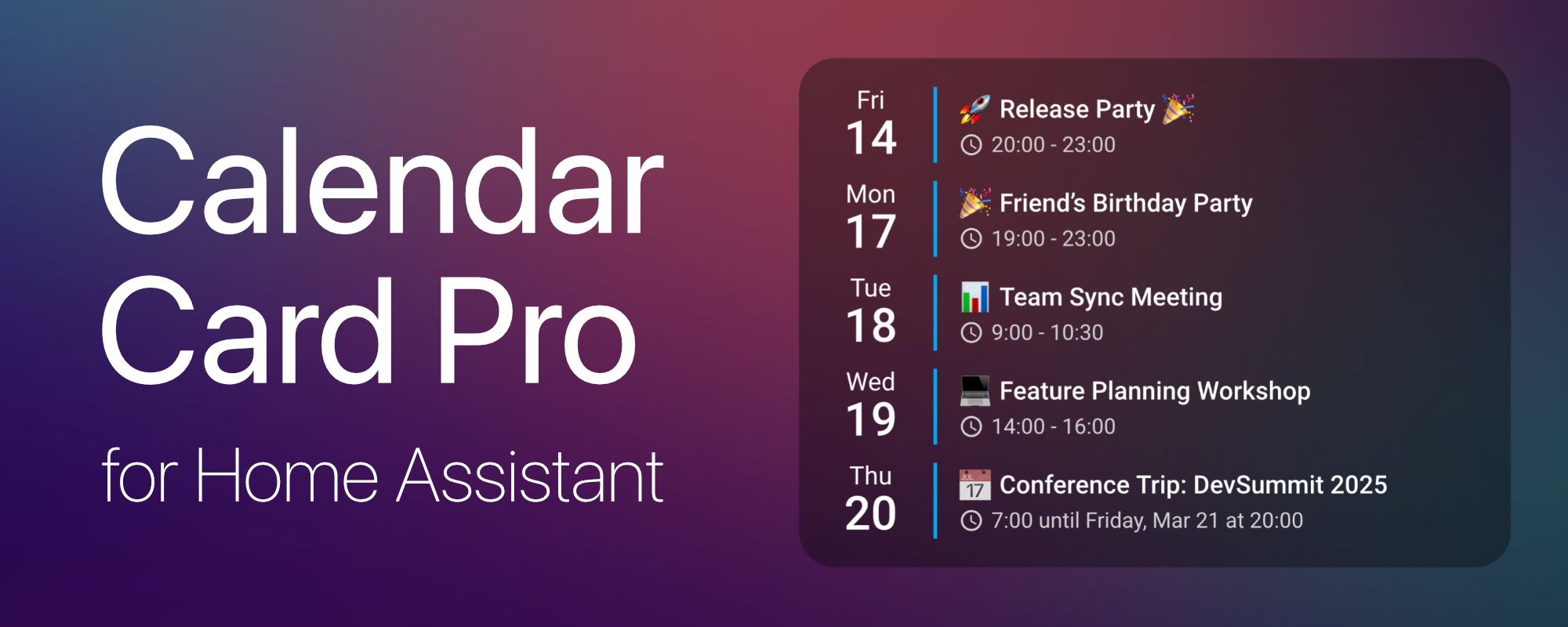
📅 A sleek and highly customizable calendar card for Home Assistant, designed for performance and a clean, modern look.
 alexpfau
git clone https://github.com/alexpfau/calendar-card-pro.gitalexpfau/calendar-card-pro
If you find Calendar Card Pro useful, consider supporting its development:
Calendar Card Pro was inspired by a beautiful calendar design using button-card and Hass calendar add-on shared in the Home Assistant community. While the original design was visually stunning, implementing it with button-card and card-mod led to performance issues.
This motivated me to create a dedicated calendar card that excels in one thing: displaying upcoming events beautifully and efficiently.
Built with performance in mind, the card leverages intelligent refresh mechanisms and smart caching to ensure a smooth experience, even when multiple calendars are in use.
Calendar Card Pro requires at least one calendar entity in Home Assistant. It is compatible with any integration that generates calendar.* entities, with CalDAV and Google Calendar being the primary tested integrations.
⚠️ Important: Ensure you have at least one calendar integration set up in Home Assistant before using this card.
➡️ View the Full Release Notes for a complete list of features.
event_icon_vertical_alignmentlabel_icon_colortime_two_digit_hourstomorrow HTML class for card-mod styling of tomorrow's eventsgrid_options.rows is setvertical_line_color → accent_color, max_events_to_show → compact_events_to_show, horizontal_line_width → day_separator_width, horizontal_line_color → day_separator_colortoday_weekday_color, today_day_color, today_month_color)show_countdown optionblocklist and allowlist patterns per entityempty_day_colorThe easiest way to install Calendar Card Pro is via HACS (Home Assistant Community Store).
https://github.com/alexpfau/calendar-card-pro as type DashboardDownload the latest release:
👉 calendar-card-pro.js
Move the file to your Home Assistant www folder:
/config/www/
Navigate to: Home Assistant → Settings → Dashboards → Resources → Add Resource
Add the resource to your Lovelace Dashboard:
url: /local/calendar-card-pro.js
type: module
Once Calendar Card Pro is installed, follow these steps to add and configure it in your Home Assistant dashboard.
calendar.* entity in Home Assistant (e.g., Google Calendar, CalDAV)."Calendar" or scroll to find "Calendar Card Pro"Note: The visual configuration editor is currently available in 8 languages, while the calendar itself supports 33 languages. Community contributions for additional editor translations are welcome!
Calendar Card Pro offers two ways to customize your card:
Visual Editor (Recommended)
YAML Configuration (Advanced)
Calendar Card Pro includes a comprehensive visual editor that makes configuration intuitive and accessible—no YAML required!
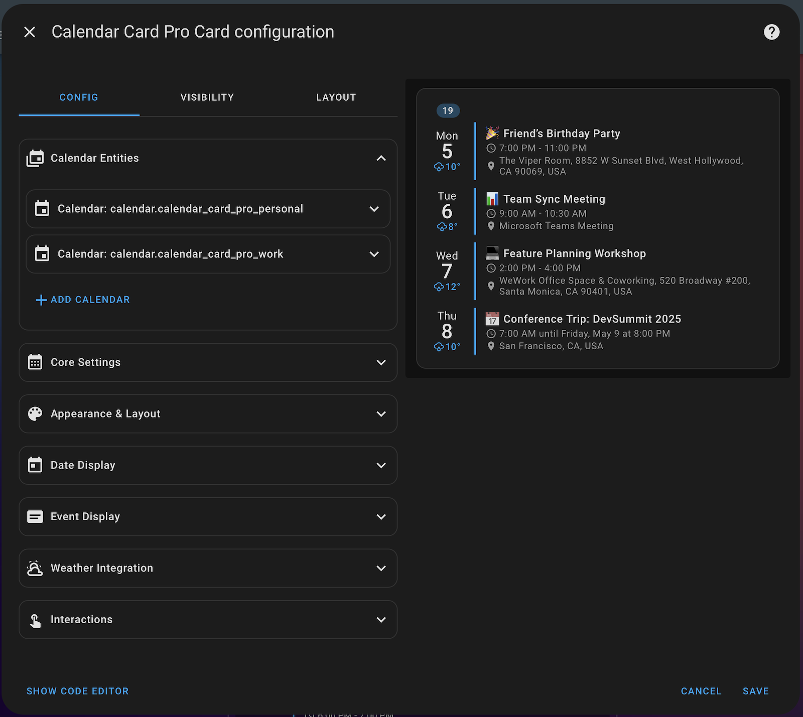
The editor is organized into logical panels that guide you through all configuration options:
Note: The visual configuration editor is currently available in 8 languages. Calendar settings applied through the editor will still display properly in all 33 supported languages.
When you open the editor with a configuration that uses deprecated parameters, the editor will detect this and offer a one-click upgrade. Example:
vertical_line_color → accent_colormax_events_to_show → compact_events_to_showSimply click "Update config..." to automatically migrate to the current parameter names.
Calendar Card Pro can display events from multiple calendar entities in Home Assistant. The entities array accepts either:
entities:
  - calendar.family # Simple entity ID (default styling)
  - entity: calendar.work
    # Advanced object with custom styling (see options below)
    color: '#1e90ff'
    accent_color: '#ff6347'
| Property | Type | Description |
|---|---|---|
| entity | string | Required. The calendar entity ID |
| label | string | Calendar label displayed before event titles. Supports text/emoji, MDI icons (mdi:icon-name), or images (/local/image.jpg) |
| color | string | Custom color for event titles from this calendar |
| accent_color | string | Custom color for the vertical line and event background (when event_background_opacity is >0) |
| label_icon_color | string | Custom color for label icons (only applies to mdi: and other icon labels) |
| show_time | boolean | Whether to show event times for this calendar (overrides global show_time setting) |
| show_location | boolean | Whether to show event locations for this calendar (overrides global show_location setting) |
| show_description | boolean | Whether to show event descriptions for this calendar (overrides global show_description setting) |
| compact_events_to_show | number | Maximum number of events to show from this calendar (works with global compact_events_to_show) |
| blocklist | string | RegExp pattern to specify events to exclude (e.g., "Private|Conference") |
| allowlist | string | RegExp pattern to specify events to include (e.g., "Birthday|Anniversary") |
This structure gives you granular control over how information from different calendars is displayed.
Calendar Card Pro provides powerful filtering capabilities to control exactly which events appear on your dashboard:
Visual Editor: Set up filters in the entity configuration panels. For each calendar entity, you can specify blocklist/allowlist patterns and configure duplicate filtering from the "Calendar Entities" section.
entities:
  - entity: calendar.work
    blocklist: 'Private|Conference' # Hide events with these words
  - entity: calendar.personal
    allowlist: 'Birthday|Anniversary' # Only show events with these words
These filters use regular expressions, allowing for flexible pattern matching:
When you subscribe to multiple calendars that might contain the same events (like shared family calendars), you can eliminate duplicates:
entities:
  - calendar.personal # Events from this calendar are prioritized
  - calendar.family # Duplicates from this calendar will be hidden
filter_duplicates: true
The duplicate detection compares:
This is especially useful for:
You can combine filtering features with labels and accent colors to create sophisticated displays. For example, to apply different styling to specific event types within the same calendar:
entities:
  - entity: calendar.family
    allowlist: 'shopping|grocery' # Only show shopping-related events
    label: '🛒' # Add shopping cart label to these events
    accent_color: '#1e88e5' # Blue accent for shopping events
  - entity: calendar.family
    allowlist: 'birthday|anniversary' # Only show celebration events
    label: '🎉' # Add celebration label to these events
    accent_color: '#e91e63' # Pink accent for celebration events
  - entity: calendar.family
    blocklist: 'shopping|grocery|birthday|anniversary' # Show all other events
    accent_color: '#607d8b' # Neutral accent for all other events
    # No label for remaining events
This technique lets you:
Calendar Card Pro offers powerful controls for managing what appears in compact and expanded views:
# Total days to fetch from API and display when expanded
days_to_show: 7

# Event limit for compact mode
compact_events_to_show: 5 # Preferred: New parameter name

# Day limit in compact mode
compact_days_to_show: 2 # Fewer days to display in compact mode

# Ensure complete days are shown
compact_events_complete_days: true # Never cut off a day's events mid-day
In addition, you can control how many events are displayed in compact mode from each calendar independently:
entities:
- entity: calendar.family # Show all events from family calendar (no limit)
- entity: calendar.work
  compact_events_to_show: 2 # Only show 2 most important work events
This feature provides several important behaviors:
The compact_days_to_show parameter lets you display fewer days in compact mode:
days_to_show: 7 # Show 7 days when expanded
compact_days_to_show: 2 # Show only the next 2 days with events in compact mode
This is useful for dashboards where you want an initial view showing just the most immediate events, with the ability to expand to view the entire week.
When using event limits, the compact_events_complete_days parameter ensures that partial days are never shown:
compact_events_to_show: 5
compact_events_complete_days: true
When enabled, this feature ensures that if at least one event from a day is shown, all events from that day will be displayed. This prevents confusion that might arise when some events from a day are visible but others are hidden.
For example, with compact_events_to_show: 5 and compact_events_complete_days: true:
These flexible view controls allow you to:
Calendar Card Pro can display multi-day events on each day they cover, making it easier to see all ongoing events and potential conflicts:
# Global setting for all calendars
split_multiday_events: true

# Entity-specific settings
entities:
  - entity: calendar.family
    split_multiday_events: true # Show family events on each day
  - entity: calendar.work
    split_multiday_events: false # Show work events only on first day (default)
When enabled, multi-day events are split in a way that preserves their original properties:
This feature is especially useful for:
The setting can be applied globally to all calendars or controlled separately for each calendar entity.
Calendar Card Pro offers flexible options for controlling which dates are displayed, allowing you to create both fixed and dynamic date ranges:
The start_date parameter can be configured in multiple ways:
Fixed dates: Use a specific date in YYYY-MM-DD format
start_date: '2025-07-01' # Always start from July 1st, 2025
Relative date expressions: Use dynamic offsets relative to the current date
start_date: "today+7"  # Always show events starting 7 days in the future
start_date: "+3"       # Shorthand for today+3 (3 days from today)
start_date: "today-2"  # Show events starting from 2 days ago
start_date: "-1"       # Shorthand for today-1 (yesterday)
When using start_date with days_to_show, the calendar will display exactly that number of days starting from the specified date:
start_date: '2025-07-01'
days_to_show: 14 # Shows July 1-14, 2025
start_date: '+7' # One week from today
days_to_show: 7 # Shows a 7-day window starting one week from today
start_date creates a static calendar view that always shows the same rangeCalendar Card Pro offers flexible options for controlling the card's size and scroll behavior:
# Fixed height - card always maintains exactly this height
height: '300px'

# Maximum height - card grows with content up to this height
max_height: '300px'

# Additional padding inside the card
additional_card_spacing: '10px'
The card offers two distinct height control mechanisms:
Fixed Height (height): Creates a card with exactly the specified height regardless of content amount. This is ideal when you need a card that perfectly fits a specific dashboard layout.
Maximum Height (max_height): Allows the card to grow naturally up to the specified limit. This provides flexibility while still ensuring the card doesn't become too large.
Both options provide:
Customize the appearance of your calendar with various styling options:
# Card background and title
title: 'My Calendar'
title_font_size: '20px'
title_color: 'var(--primary-color)'
background_color: 'var(--ha-card-background)'

# Event appearance
event_background_opacity: 15 # 0-100 scale for background color intensity
vertical_line_width: '3px' # Width of the colored event indicator line
The event_background_opacity setting (ranging from 0-100) works together with each calendar's accent_color to create semi-transparent backgrounds for events. At 0 (default), events have no background color. Higher values create more intense backgrounds.
When styling your calendar, you can use:
#ff6c92, rgba(255,0,0,0.5))var(--primary-color))red, blue)Fine-tune the spacing and alignment of your calendar elements:
# Spacing between elements
day_spacing: '8px' # Space between different calendar days
event_spacing: '6px' # Internal padding within each event

# Date column alignment
date_vertical_alignment: 'top' # Options: 'top', 'middle', 'bottom'
The date_vertical_alignment option controls how dates align with their events, which is especially noticeable when a day has many events. The default middle setting centers the date between its events, while top aligns it with the first event and bottom with the last event.
For improved organization with longer calendar views, you can enable week numbers and visual separators:
# Week number configuration
show_week_numbers: 'iso' # 'iso', 'simple', or null to disable
show_current_week_number: true # Show week number for the first week
first_day_of_week: 'monday' # 'monday', 'sunday', or 'system'

# Week number styling
week_number_font_size: '12px'
week_number_color: 'var(--primary-text-color)'
week_number_background_color: '#03a9f450'

# Separator configuration
day_separator_width: '1px' # Line between days
day_separator_color: '#03a9f430'
week_separator_width: '2px' # Line between weeks
week_separator_color: '#03a9f480'
month_separator_width: '3px' # Line between months
month_separator_color: '#03a9f4'
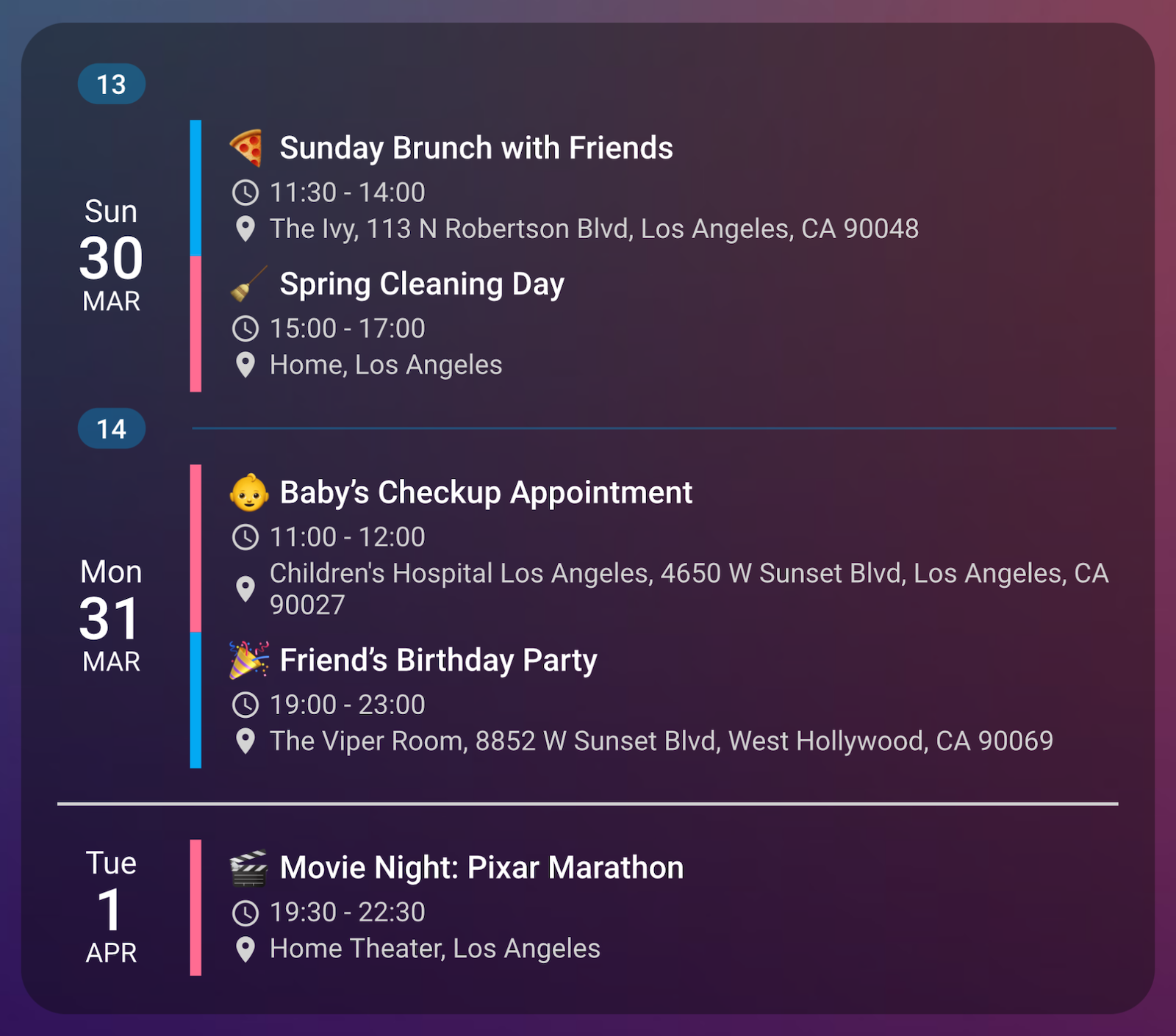
This feature creates a sophisticated visual hierarchy with:
The separators follow an intelligent precedence system:
Week numbers can be displayed using either:
Control the appearance of the date column for a personalized calendar view:
# Base date column styling
weekday_font_size: '14px'
weekday_color: 'var(--primary-text-color)'
day_font_size: '26px'
day_color: 'var(--primary-text-color)'
month_font_size: '12px'
month_color: 'var(--primary-text-color)'

# Special styling for weekends (inherits from base when not specified)
weekend_weekday_color: '#e67c73' # Weekend day names
weekend_day_color: '#e67c73' # Weekend day numbers
weekend_month_color: '#e67c73' # Weekend month names

# Special styling for today (inherits from base/weekend when not specified)
today_weekday_color: '#03a9f4' # Today's weekday name
today_day_color: '#03a9f4' # Today's day number
today_month_color: '#03a9f4' # Today's month name
The date column appears on the left side of each day's events and helps users quickly identify when events occur. By default, all dates use the base styling, but you can apply special styling to:
weekend_* parameterstoday_* parametersWhen special styling parameters are not specified, they will inherit from the base styling. If today falls on a weekend, today styling takes precedence over weekend styling.
Calendar Card Pro provides a sophisticated way to highlight the current day with a customizable indicator:
Visual Editor: Configure today indicators in the "Date Display" section, where you can choose from dots, pulses, glows, custom icons, emojis or images, and adjust their position.
# Enable and choose indicator type
today_indicator: true # Enable basic dot indicator (default)
today_indicator: pulse # Animated pulsing dot
today_indicator: glow # Glowing dot
today_indicator: mdi:star # Any Material Design icon
today_indicator: 🎯 # Emoji
today_indicator: /local/custom-indicator.png # Image path

# Position the indicator precisely with CSS-like coordinates
today_indicator_position: "15% 50%" # Centered left in the date column (default)
today_indicator_position: "15% 15%" # Top left
today_indicator_position: "85% 15%" # Top right
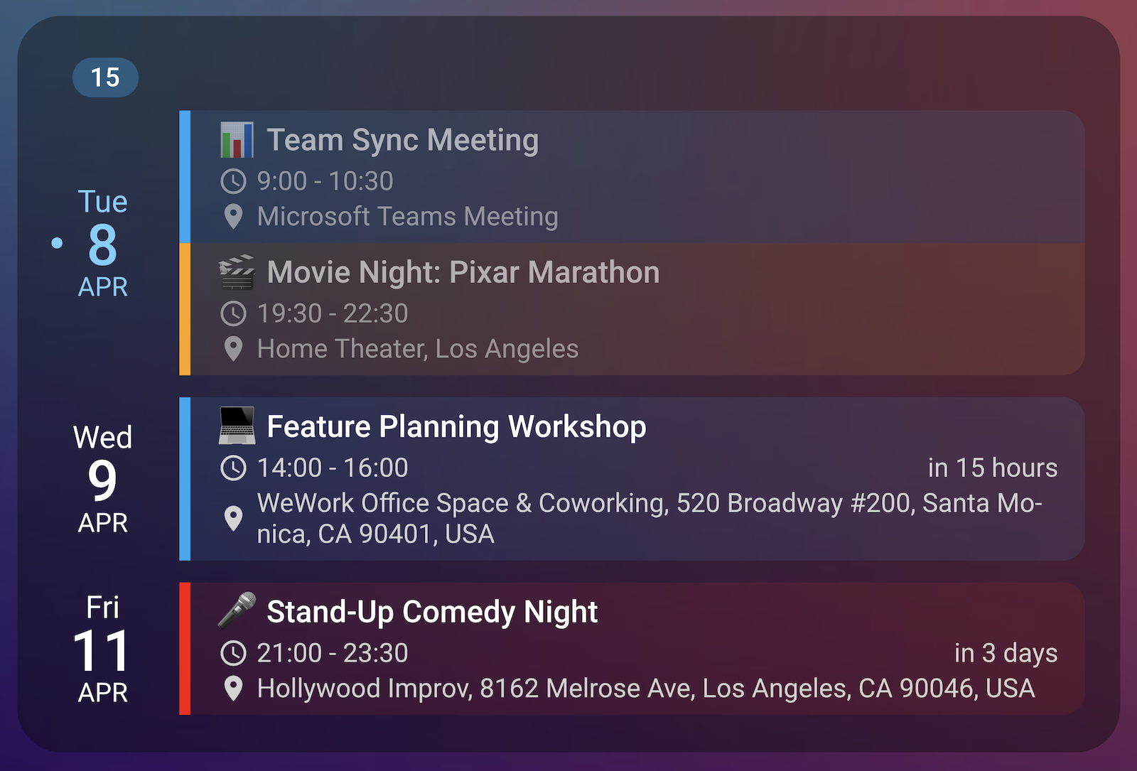
The indicator is precisely positioned and always properly centered on the coordinates specified, making it ideal for creating visual emphasis on today's date.
Available indicator types:
true or dot: Simple dot indicatorpulse: Animated pulsing dotglow: Glowing dot with subtle light effectmdi:icon-name: Any Material Design Icon🎯 or ⭐The today_indicator_position parameter accepts CSS-like position values in the format "x% y%", allowing precise placement of the indicator anywhere within the date column.
Control how event information is presented on your calendar:
# Event title appearance
event_font_size: '14px'
event_color: 'var(--primary-text-color)'

# Empty days display
show_empty_days: true # Show days with no events
empty_day_color: 'var(--secondary-text-color)' # Color for "No events" text
When show_empty_days is set to true, days without events will display a "No events" message. This helps maintain visual consistency across your calendar, especially when showing longer date ranges.
The new empty_day_color parameter lets you customize the color of this message to match your theme or stand out as needed.
Configure how event times and locations are displayed:
# Time display options
show_time: true # Show event start/end times
show_single_allday_time: false # Hide time for single-day all-day events
time_24h: false # Use 12-hour format (AM/PM)
time_two_digit_hours: false # Use 2 digits in hours
show_end_time: true # Show event end time
time_font_size: '12px'
time_color: 'var(--secondary-text-color)'
time_icon_size: '14px'

# Location display options
show_location: true
remove_location_country: true # Remove country names from addresses
location_font_size: '12px'
location_color: 'var(--secondary-text-color)'
location_icon_size: '14px'
The remove_location_country parameter offers three modes:
# Option 1: Don't remove any country information
remove_location_country: false

# Option 2: Use built-in country detection
remove_location_country: true

# Option 3: Specify exactly which countries to remove (perfect for international users)
remove_location_country: "USA|United States|Canada"
These options provide significant flexibility:
Example scenario: If you live in the USA but frequently have events in other countries, you could use:
remove_location_country: 'USA|United States|U.S.A.|U.S.'
This would keep location details like "Paris, France" intact while simplifying domestic addresses to just city and state.
Display event descriptions below event titles for additional context:
# Description display options
show_description: true
description_max_lines: 3 # Limit to 3 lines (0 = unlimited)
description_font_size: '12px'
description_color: 'var(--secondary-text-color)'
description_icon_size: '14px'
Descriptions are automatically processed:
&, <) are decoded to their proper characters... when description_max_lines is setYou can also control description visibility per calendar entity:
entities:
  - entity: calendar.work
    show_description: true # Show descriptions for work events
  - entity: calendar.personal
    show_description: false # Hide descriptions for personal events
Show how much time remains until an event starts with the countdown display feature:
# Enable countdown display for events
show_countdown: true
When enabled, a subtle countdown string appears next to each upcoming event, showing the remaining time in a natural language format like "in 3 days" or "in 2 hours". This helps users quickly identify how soon events will begin.
Control visibility of events that have already occurred:
show_past_events: true # Show today's events that have already ended
When enabled, past events appear with reduced opacity (60%) to visually distinguish them from upcoming events.
Weekend days (Saturday and Sunday) can be styled differently from weekdays to make them stand out in your calendar. You can customize:
weekend_weekday_color: Sets the text color for weekday names (e.g., "Sat", "Sun")weekend_day_color: Sets the text color for the day numberweekend_month_color: Sets the text color for the month nameExample configuration:
type: custom:calendar-card-pro
entities:
  - calendar.personal
  - calendar.work
weekend_weekday_color: '#E67C73'
weekend_day_color: '#E67C73'
weekend_month_color: '#E67C73'
This styling helps users quickly distinguish weekend days from weekdays, making the calendar more visually informative and easier to scan.
Calendar Card Pro can display a progress bar for events that are currently running, showing how much of the event has completed.
The progress bar appears in the same space as the countdown display (they're mutually exclusive - a countdown shows for future events, while a progress bar shows for running events). This provides a clean, visual indication of your event's progress without taking up additional space.
To enable progress bars:
show_progress_bar: true
You can customize the appearance of the progress bars:
show_progress_bar: true
progress_bar_color: '#03a9f4'
progress_bar_height: '10px'
progress_bar_width: '80px'
The progress bar is especially useful for tracking ongoing meetings, webinars, or appointments, giving you a quick visual reference of how much time remains.
Calendar Card Pro can display weather forecasts alongside your calendar events, providing a complete view of both your schedule and the expected weather conditions.
Visual Editor: Access all weather settings in the "Weather Integration" section of the editor, where you can select your weather entity and configure display options for both date and event positions.
type: custom:calendar-card-pro
entities:
  - calendar.family
days_to_show: 5
weather:
  entity: weather.forecast_home
  position: both # Options: 'date', 'event', or 'both'
  date:
    # Date column shows condition icon and high temperature only
    show_conditions: true
    show_high_temp: true
    show_low_temp: false
    icon_size: '16px'
    font_size: '14px'
    color: '#3498db'
  event:
    # Event row shows just the temperature (no icon)
    show_conditions: false
    show_temp: true
    font_size: '13px'
    color: 'var(--secondary-text-color)'
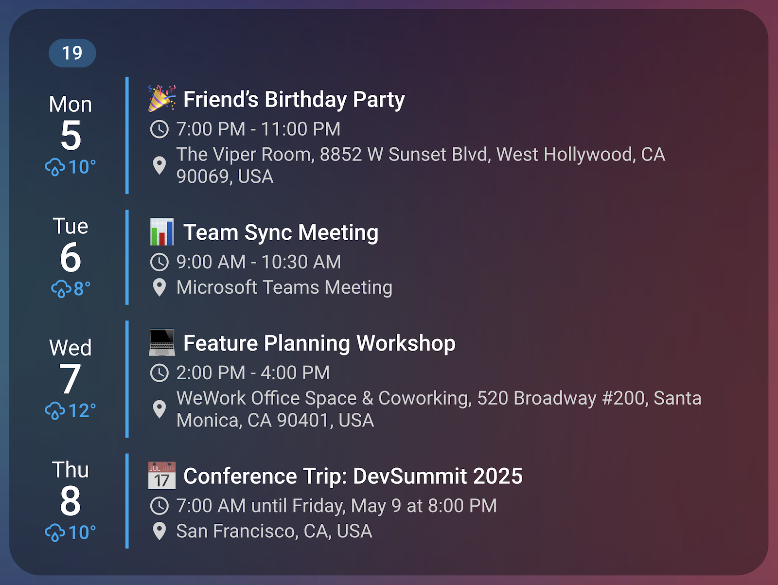
This flexible configuration allows you to create a personalized experience that shows exactly the weather information you need, where you need it.
| Option | Type | Default | Description |
|---|---|---|---|
entity |
string | - | Weather entity to use for forecasts |
position |
string | date |
Where to show weather data: 'date' (date column), 'event' (next to events), or 'both' |
date → show_conditions |
boolean | true |
Whether to show weather condition icons in date column |
date → show_high_temp |
boolean | true |
Whether to show high temperature in date column |
date → show_low_temp |
boolean | false |
Whether to show low temperature in date column |
date → show_uv_index |
boolean | false |
Whether to show UV index in date column |
date → uv_index_threshold |
number | 0 |
Only show UV index when it exceeds this value (0 = always show when enabled) |
date → icon_size |
string | 14px |
Size of weather icons in date column |
date → font_size |
string | 12px |
Size of weather text in date column |
date → color |
string | var(--primary-text-color) |
Color of weather text and icons in date column |
event → show_conditions |
boolean | true |
Whether to show weather condition icons in event column |
event → show_temp |
boolean | true |
Whether to show temperature in event column |
event → show_uv_index |
boolean | false |
Whether to show UV index in event column |
event → uv_index_threshold |
number | 0 |
Only show UV index when it exceeds this value (0 = always show when enabled) |
event → icon_size |
string | 14px |
Size of weather icons in event column |
event → font_size |
string | 12px |
Size of weather text in event column |
event → color |
string | var(--primary-text-color) |
Color of weather text and icons in event column |
You can choose where weather information appears in your calendar:
date: Shows daily forecasts in the date column (left side)event: Shows hourly forecasts next to event titlesboth: Displays weather in both positions simultaneouslyEach display position can be customized independently with different content and styling:
Date Column Weather:
show_conditions: Show weather condition icon (sun, cloud, rain, etc.)show_high_temp: Show high temperatureshow_low_temp: Show low temperatureshow_uv_index: Show UV indexuv_index_threshold: Minimum UV index value to display (0 = always)icon_size: Weather icon sizefont_size: Temperature text sizecolor: Text and icon colorEvent Weather:
show_conditions: Show weather condition iconshow_temp: Show temperatureshow_uv_index: Show UV indexuv_index_threshold: Minimum UV index value to display (0 = always)icon_size: Weather icon sizefont_size: Temperature text sizecolor: Text and icon colorWeather integration is particularly useful for:
The feature automatically matches weather data to the correct time periods:
One of Calendar Card Pro's most powerful features is the ability to toggle between compact and expanded views:
# Limit events in compact view
compact_events_to_show: 5

# Enable expand/collapse with tap
tap_action:
  action: expand
When a compact_events_to_show limit is set, the card displays that number of events initially, adding a subtle indicator when more events are available. The expand action then allows users to toggle between this compact view and the full list of events.
When using expansion with both global and per-calendar limits:
Example scenario: If you have a configuration like this:
entities:
  - entity: calendar.family
    # No limit for family calendar
  - entity: calendar.work
    compact_events_to_show: 2
    # Never show more than 2 work events
  - entity: calendar.holidays
    compact_events_to_show: 1
    # Only show 1 holiday event
compact_events_to_show: 4
# Show at most 4 events total in compact mode

tap_action:
  action: expand
In compact mode, you'll see at most 4 events total, with work showing at most 2 and holidays showing at most 1.
In expanded mode after tapping, the global limit of 4 is removed, but you'll still only see 2 work events and 1 holiday event, while all family events within your configured days_to_show range will be visible.
Calendar Card Pro supports all standard Home Assistant actions:
# Navigate to another view on tap
tap_action:
  action: navigate
  navigation_path: /lovelace/calendar

# Open a URL on long press
hold_action:
  action: url
  url_path: https://calendar.google.com
| Action Type | Description | Additional Parameters |
|---|---|---|
expand |
Toggle between compact and full calendar view | None |
more-info |
Open the Home Assistant entity dialog | None |
navigate |
Go to another Lovelace view | navigation_path: /lovelace/view |
url |
Open external URL or internal page | url_path: https://example.com |
call-service |
Call any Home Assistant service | service: domain.service, service_data: { key: value } |
none |
Disable the action | None |
All actions integrate seamlessly with Home Assistant's native ripple effect and haptic feedback for a polished user experience.
Calendar Card Pro uses several techniques to ensure smooth performance:
# Cache and refresh settings
refresh_interval: 30 # Minutes between data refresh
refresh_on_navigate: false # Keep cache when switching dashboard views
The card's advanced rendering engine:
Smart caching minimizes API calls to your calendar integrations. By default, data refreshes every 30 minutes and when navigating between views, but you can adjust this behavior with refresh_interval and refresh_on_navigate.
Calendar Card Pro seamlessly integrates with all Home Assistant themes and fully supports card-mod customization:
Custom title styling:
type: custom:calendar-card-pro
title: Family Schedule
card_mod:
  style: |
    ha-card .header-container h1.card-header {
      width: 100%;
      text-align: center;
      font-weight: bold;
      border-bottom: 1px solid var(--primary-color);
      float: none !important; /* Override the default float:left */
    }
Highlight today's events:
type: custom:calendar-card-pro
card_mod:
  style: |
    /* Make today's events stand out */
    .day-table.today .event-title {
      font-size: 16px !important;     /* Larger text */
      font-weight: bold !important;   /* Bold text */
      color: var(--accent-color) !important; /* Use theme accent color */
    }

    /* Add subtle left border pulse animation */
    .day-table.today .event {
      border-left-width: 4px !important;
      transition: border-left-color 1s ease-in-out;
      animation: todayPulse 3s infinite alternate;
    }

    @keyframes todayPulse {
      from { border-left-color: var(--accent-color); }
      to { border-left-color: var(--primary-color); }
    }
Highlight tomorrow's events:
This works analogously to "today" as seen above, but using the "tomorrow" class. For example:
type: custom:calendar-card-pro
card_mod:
  style: |
    /* Make tomorrow's events stand out */
    .day-table.tomorrow .event-title {
      font-size: 16px !important;     /* Larger text */
      font-weight: bold !important;   /* Bold text */
      color: var(--accent-color) !important; /* Use theme accent color */
    }
Frameless calendar integration:
type: custom:calendar-card-pro
card_mod:
  style: |
    ha-card {
      border-radius: 0;
      border: none;
      box-shadow: none;
      background: transparent !important;
    }
Move time into the same row as the event title:
card_mod:
  style: |
    div.event-content {
      display: grid;
      grid-template-areas:
        "title time"
        "location location";
      grid-template-columns: 1fr auto;
      column-gap: 10px;
      row-gap: 0px;
    }

    div.summary {
      grid-area: title;
      overflow: hidden;
      text-overflow: ellipsis;
    }

    div.time {
      grid-area: time;
      white-space: nowrap;
    }

    div.location {
      grid-area: location;
      white-space: normal;
      overflow: hidden;
      text-overflow: ellipsis;
    }

    div.time-location {
      display: contents;
    }
These examples demonstrate how Calendar Card Pro can be customized to match any dashboard design using card-mod's powerful CSS customization capabilities.
| Variable | Type | Default | Description |
|---|---|---|---|
| Core Settings | |||
entities |
array | Required | List of calendar entities with optional styling (see Entity Configuration below) |
start_date |
string | Today | Custom start date for the calendar (YYYY-MM-DD format). Also supports relative date expressions like today+7 to display events starting 7 days from today, or today-3 to show events from 3 days ago. You can also use shorthand notation +7 or -3. |
days_to_show |
number | 3 |
Number of days to display |
compact_days_to_show |
number | - | Number of days to display in compact mode |
compact_events_to_show |
number | - | Number of events to show in compact mode |
compact_events_complete_days |
boolean | false |
When true, shows all events for days that have at least one event displayed |
show_empty_days |
boolean | false |
Whether to show days with no events (with "No events" message) |
filter_duplicates |
boolean | false |
Remove duplicate events that appear in multiple calendars |
split_multiday_events |
boolean | false |
Display multi-day events on each day they cover |
language |
string | System, fallback en |
Interface language (auto-detects from HA) |
| Header | |||
title |
string | - | Card title |
title_font_size |
string | --calendar-card-font-size-title |
Card title font size |
title_color |
string | --calendar-card-color-title |
Card title font color |
| Layout and Spacing | |||
background_color |
string | --ha-card-background |
Card background color |
accent_color |
string | #03a9f4 |
Vertical line separator color |
vertical_line_width |
string | 2px |
Vertical line separator width |
day_spacing |
string | 5px |
Spacing between different calendar day rows (replaces row_spacing) |
event_spacing |
string | 4px |
Vertical padding within each event |
additional_card_spacing |
string | 0px |
Additional top/bottom padding for the card |
height |
string | auto |
Sets a fixed, exact height for the card regardless of content amount (always this height, never more or less) |
max_height |
string | none |
Allows the card to grow with content up to this maximum height limit |
| Week Numbers and Horizontal Separators | |||
show_week_numbers |
string | null |
Week number display method ('iso', 'simple', or null to disable) |
show_current_week_number |
boolean | true |
Whether to show week number for the first/current week in view |
week_number_font_size |
string | 14px |
Font size for week number pills |
week_number_color |
string | var(--primary-text-color) |
Text color for week number pills |
week_number_background_color |
string | #03a9f450 |
Background color for week number pills |
first_day_of_week |
string | system |
First day of week ('monday', 'sunday', or 'system') |
day_separator_width |
string | 0px |
Width of separator line between days |
day_separator_color |
string | var(--secondary-text-color) |
Color of separator line between days |
week_separator_width |
string | 0px |
Width of separator line between weeks |
week_separator_color |
string | #03a9f450 |
Color of separator line between weeks |
month_separator_width |
string | 0px |
Width of separator line between months |
month_separator_color |
string | var(--primary-text-color) |
Color of separator line between months |
| Today Indicator | |||
today_indicator |
boolean or string | false |
Today indicator type: true/dot (basic dot), pulse (animated dot), glow (glowing effect), custom MDI icon (e.g., mdi:star), emoji, or image path |
today_indicator_position |
string | 15% 50% |
Position of today indicator in CSS-like format (x% y%) |
today_indicator_color |
string | #03a9f4 |
Color of the today indicator |
today_indicator_size |
string | 6px |
Size of the today indicator |
| Date Column | |||
date_vertical_alignment |
string | middle |
Vertical alignment of date column (top, middle, or bottom) |
weekday_font_size |
string | 14px |
Weekday name font size |
weekday_color |
string | --primary-text-color |
Weekday name font color |
day_font_size |
string | 26px |
Day numbers font size |
day_color |
string | --primary-text-color |
Day numbers font color |
show_month |
boolean | true |
Whether to show month names |
month_font_size |
string | 12px |
Month name font size |
month_color |
string | --primary-text-color |
Month name font color |
weekend_weekday_color |
string | var(--primary-text-color) |
Color for the weekday name (e.g., "Sat", "Sun") on weekend days |
weekend_day_color |
string | var(--primary-text-color) |
Color for the day number on weekend days |
weekend_month_color |
string | var(--primary-text-color) |
Color for the month name on weekend days |
today_weekday_color |
string | var(--primary-text-color) |
Color for the weekday name (e.g., "Sat", "Sun") on today's date |
today_day_color |
string | var(--primary-text-color) |
Color for the day number on today's date |
today_month_color |
string | var(--primary-text-color) |
Color for the month name on today's date |
| Event Column | |||
event_background_opacity |
number | 0 |
Background opacity (0-100) for events using entity accent color |
event_icon_vertical_alignment |
string | middle |
Vertical alignment of event icons (time, location, description): top, middle, or bottom |
show_past_events |
boolean | false |
Whether to show today's events that have already ended |
show_countdown |
boolean | false |
Show how much time remains until an event starts |
show_progress_bar |
boolean | false |
Whether to show a progress bar for currently running events |
progress_bar_color |
string | var(--secondary-text-color) |
Color of the progress bar |
progress_bar_height |
string | calc(var(--calendar-card-font-size-time) * 0.75) |
Height of the progress bar |
progress_bar_width |
string | 60px |
Width of the progress bar |
empty_day_color |
string | --primary-text-color |
Color for "No events" text on empty days |
event_font_size |
string | 14px |
Event title font size |
event_color |
string | --primary-text-color |
Event title font color |
show_time |
boolean | true |
Whether to show event times |
show_single_allday_time |
boolean | true |
Whether to show time display for all-day single-day events |
time_24h |
boolean | System |
Whether to use 24-hour time format (auto-detects from HA) |
time_two_digit_hours |
boolean | false |
Whether to use 2 digits in hours |
show_end_time |
boolean | true |
Whether to show event end times |
time_icon_size |
string | 14px |
Clock icon size (replaces time_location_icon_size) |
time_font_size |
string | 12px |
Event time font size |
time_color |
string | --secondary-text-color |
Event time font color |
show_location |
boolean | true |
Whether to show event locations |
remove_location_country |
boolean or string | true |
Whether to remove country names from locations. Can be boolean (true/false) or a regex pattern string (e.g., "USA | United States | Canada") to specify which countries to remove |
location_icon_size |
string | 14px |
Location icon size (replaces time_location_icon_size) |
location_font_size |
string | 12px |
Event location font size |
location_color |
string | --secondary-text-color |
Event location font color |
show_description |
boolean | false |
Whether to show event descriptions |
description_icon_size |
string | 14px |
Description icon size |
description_font_size |
string | 12px |
Event description font size |
description_color |
string | --secondary-text-color |
Event description font color |
description_max_lines |
number | 0 |
Maximum number of lines to show for event descriptions (0 = unlimited). Truncated text shows ... |
| Weather | |||
weather |
object | - | Weather configuration object containing the below settings |
weather → entity |
string | - | Home Assistant weather entity to use for forecasts |
weather → position |
string | date |
Where to show weather data: date (in date column), event (next to events), or both (in both positions) |
weather → date |
object | - | Configuration for weather display in the date column |
weather → event |
object | - | Configuration for weather display next to events |
| Actions | |||
tap_action |
object | none |
Action when tapping the card |
hold_action |
object | none |
Action when holding the card |
| Cache and Refresh | |||
refresh_interval |
number | 30 |
Time in minutes between data refreshes |
refresh_on_navigate |
boolean | true |
Whether to force refresh data when navigating between dashboard views |
This section provides different configuration setups to help you get started with Calendar Card Pro.
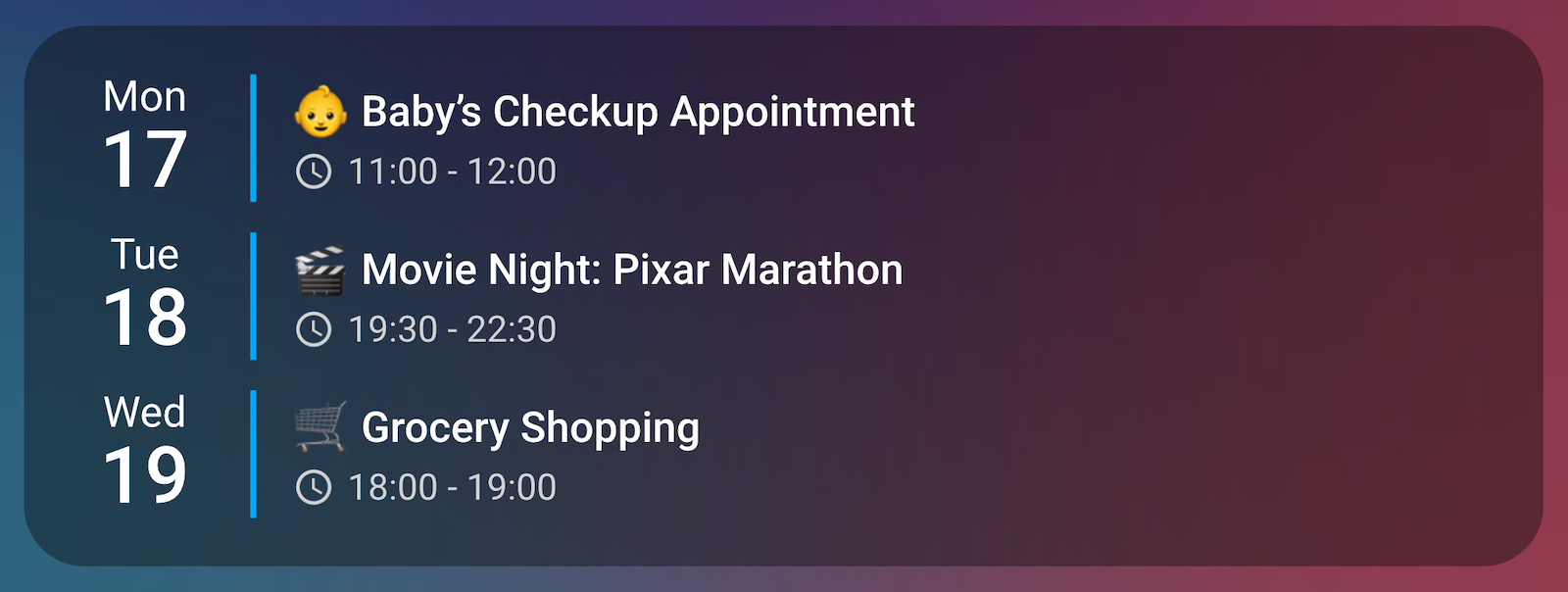
A simple setup displaying events from a single calendar. Automatically adapts to themes and dark/light mode.
With Home Assistant default theme (light mode):
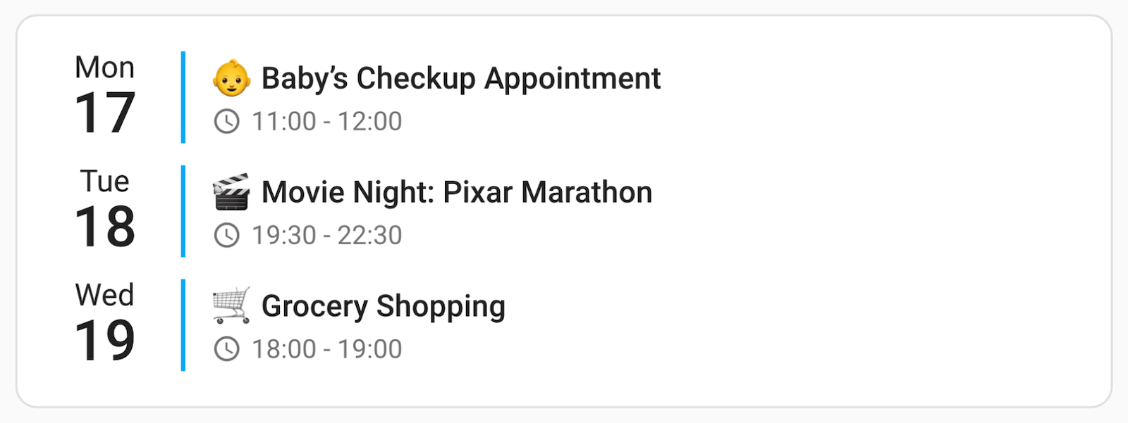
Using my favorite iOS Theme (ios-dark-mode-blue-red-alternative):
type: custom:calendar-card-pro
entities:
  - calendar.family
days_to_show: 3
show_location: false
show_month: false
This setup includes multiple calendars, each with a custom color. The compact mode ensures that only a limited number of events are shown at once. Screenshots again showing my favorite iOS Theme (ios-dark-mode-blue-red-alternative).
Compact view:
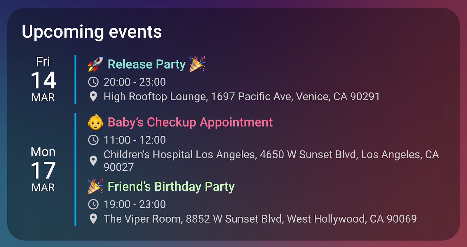
After tap ➡️ expanded view:
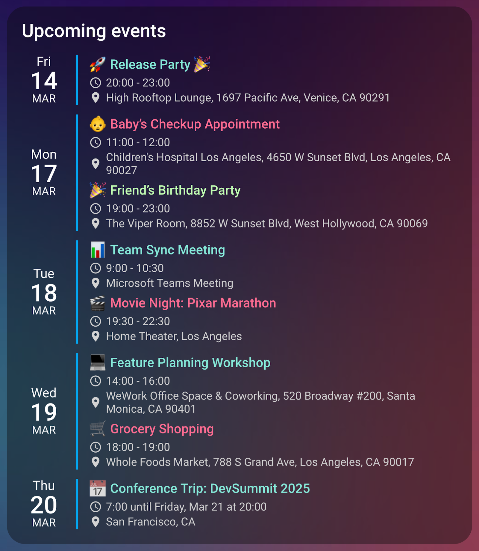
type: custom:calendar-card-pro
title: Upcoming events
entities:
  - entity: calendar.family
    color: '#ff6c92' # Red for family events
  - entity: calendar.work
    color: '#86ebda' # Blue for work events
  - entity: calendar.personal
    color: '#c2ffb3' # Green for personal events
days_to_show: 7
compact_events_to_show: 3 # Always only show 3 events
tap_action:
  action: expand # Tap to expand/collapse
This example demonstrates how to use accent colors and background opacity to create visual distinction between different calendars. The accent colors are used for both the vertical line and a semi-transparent background.
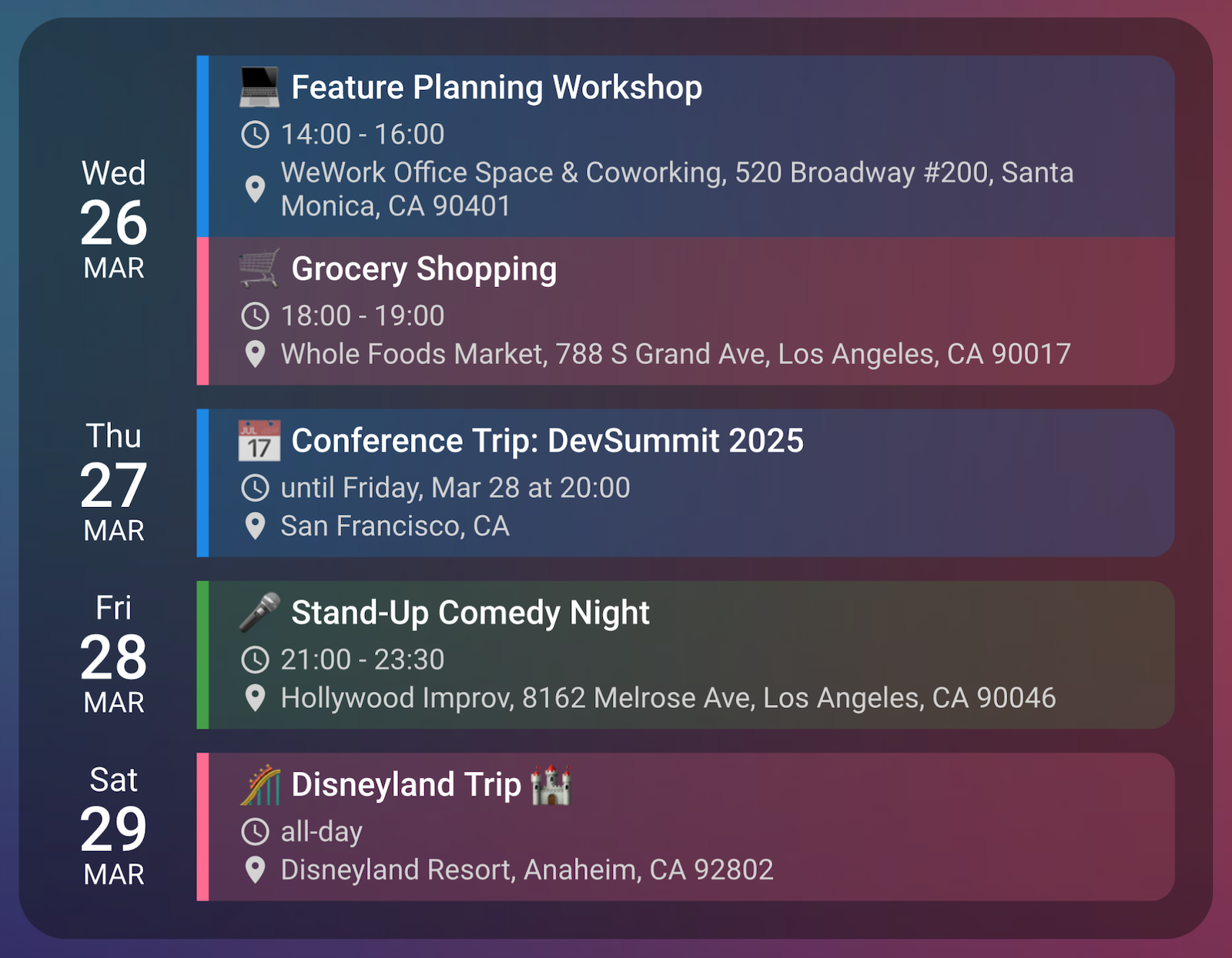
type: custom:calendar-card-pro
entities:
  - entity: calendar.family
    accent_color: '#ff6c92'
  - entity: calendar.work
    accent_color: '#1e88e5'
  - entity: calendar.personal
    accent_color: '#43a047'
days_to_show: 5
compact_events_to_show: 5
event_background_opacity: 20
vertical_line_width: 5px
event_spacing: 6px
This configuration showcases the week number display and visual separators features. It creates a clear hierarchy with different separator widths for weeks and months.
more like this
Widgets for Douban and Trakt watchlists plus personalized recommendations, live TV streaming including PlutoTV, Yatu ra…
A small display for ESPHome and Home Assistant to retrieve the current house consumption and energy price via a sensor…
search projects, people, and tags