ForwardWidgets
Widgets for Douban and Trakt watchlists plus personalized recommendations, live TV streaming including PlutoTV, Yatu ra…
JavaScript★ 247
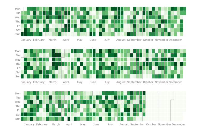
The easiest and best looking Calendar Heatmap you'll find, made with Plotly.
 brunorosilva
git clone https://github.com/brunorosilva/plotly-calplot.gitbrunorosilva/plotly-calplotMaking it easier to visualize and costumize time relevant or time series data with plotly interaction.
Important - I'll not be maintaining this project any longer (and I haven't for quite some time) - please use Thomaz plotly-calheatmap instead
New to the library? Read this Medium article.
This plot is a very similar to the contribuitions available on Github and Gitlab profile pages and to Calplot - which is a pyplot implementation of the calendar heatmap, thus it is not interactive right off the bat.
The first mention I could find of this plot being made with plotly was in this forum post and it got my attention as something that should be easily available to anyone.
pip install plotly-calplot
In this Medium article I covered lot's of usage methods for this library.
from plotly_calplot import calplot

fig = calplot(df, x="date", y="value")
fig.show()
# you can also adjust layout and your usual plotly stuff
more like this
Widgets for Douban and Trakt watchlists plus personalized recommendations, live TV streaming including PlutoTV, Yatu ra…
meine 🌒 - A CLI file manager and system utility built with Textual. It combines intuitive command parsing with rich t…
search projects, people, and tags