lehar
Visualize data using relative ordering
 darxtrix
Python★ 80⑂ 4 forksMITupdated 8 years ago
git clone https://github.com/darxtrix/lehar.gitdarxtrix/leharREADME.mdfork it — it’s yours
lehar
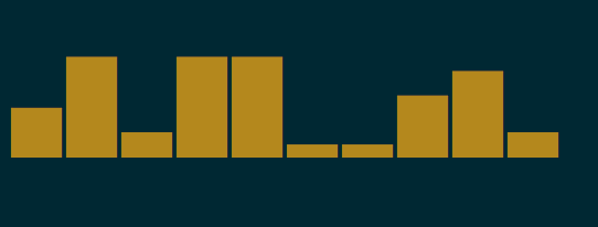
Python library to generate sparklines ▁▂▄▅▇█ in your shell based upon relative ordering of data. lehar is a Hindi word which means wave. lehar can be invoked via commandline also.
# Find commits by authors in a git repo
$ git shortlog -s | cut -f1 | lehar
▇▁▁▁▁▁▁▂▃▁▁█▁▁▂▃▅▁▁▁▂▆▁▁▁▂▁▁▁▁▂▇▁▅▆▁▁▁▄▁▁█▁▁▂▁▂▁
Why ? : https://medium.com/@darxtrix/visualizing-data-in-terminal-using-lehar-7cfded09c1ad
Note
Each data point in the data set is plotted relative to the maximum data point value with the maximum having the highest plot height. And they are only 5 possible heights so two number with very less fraction difference relative to max data point can take same plot height. Its a way of visualizing variations in data.
Demo
Installation
Using pip
$ pip install lehar
API
lehar.draw(numbers,options)
numbers
type : list
options
Only supported option is color
eg. color='red'
Basic Usage
>>> import lehar

# Strings
>>> lehar.draw(["0","1","2","3","4"])
'▁▂▄▆█'

# Numbers
>>> lehar.draw([0,1,2,3,4])
'▁▂▄▆█'

# Negatives
>>> lehar.draw([1,3,-34,12,44,81,0])
'▃▃▁▄▆█▃'

# Missing data
>>> lehar.draw([1,3,-34,'',12,44,'',81,0])
'▃▃▁ ▄▆ █▃'
Adding colors
>>> lehar.draw(["0","1","2","3","4"],color="yellow")

>>> lehar.draw([1,3,-34,'',12,44,'',81,0],color="cyan")
Command line
$ lehar 1 2 3 4 5

$ lehar -c red 1 2 3 4 5

$ echo "-c cyan 1 2 3 4 5" | lehar

$ lehar < input
Support
lehar supports both Python2 & Python3.
Contributing Guide
- Setup
$ git clone https://github.com/darxtrix/lehar
$ cd lehar
$ pip install -r requirements.txt
$ python setup.py develop
$ lehar
- Tests are located at
lehar/tests.pyand covergae tests are located at.travis.yml
$ python tests.py
- While sending a pull request increment the version at VERSION and make sure the travis build passes.
Some feedback please
Please file as issue here for suggesting the improvements required.
License
MIT © Ankush Sharma
more like this