ForwardWidgets
Widgets for Douban and Trakt watchlists plus personalized recommendations, live TV streaming including PlutoTV, Yatu ra…
JavaScript★ 247
📅 A date picker components for ionic2 /ionic3 / ionic4
 hsuanxyz

English is not my native language; please excuse typing errors. 中文文档
^3.0.0 2.x4.0.0live demo click me.
$ npm install ion2-calendar moment --save
import { NgModule } from '@angular/core';
import { IonicApp, IonicModule } from '@ionic/angular';
import { MyApp } from './app.component';
...
import { CalendarModule } from 'ion2-calendar';

@NgModule({
  declarations: [
    MyApp,
    ...
  ],
  imports: [
    IonicModule.forRoot(),
    CalendarModule
  ],
  bootstrap: [MyApp],
  ...
})
export class AppModule {}
import { NgModule } from '@angular/core';
import { IonicApp, IonicModule } from 'ionic-angular';
import { MyApp } from './app.component';
...
import { CalendarModule } from "ion2-calendar";

@NgModule({
  declarations: [
    MyApp,
    ...
  ],
  imports: [
    IonicModule.forRoot(MyApp),
    // See CalendarComponentOptions for options
    CalendarModule.forRoot({
      doneLabel: 'Save',
      closeIcon: true
    })
  ],
  bootstrap: [IonicApp],
  entryComponents: [
    MyApp,
    ...
  ]
})
export class AppModule {}
<ion-calendar [(ngModel)]="date"
              (change)="onChange($event)"
              [type]="type"
              [format]="'YYYY-MM-DD'">
</ion-calendar>
import { Component } from '@angular/core';

@Component({
  selector: 'page-home',
  templateUrl: 'home.html'
})
export class HomePage {
  date: string;
  type: 'string'; // 'string' | 'js-date' | 'moment' | 'time' | 'object'
  constructor() { }

  onChange($event) {
    console.log($event);
  }
  ...
}
<ion-calendar [(ngModel)]="dateRange"
              [options]="optionsRange"
              [type]="type"
              [format]="'YYYY-MM-DD'">
</ion-calendar>
import { Component } from '@angular/core';
import { CalendarComponentOptions } from 'ion2-calendar';

@Component({
  selector: 'page-home',
  templateUrl: 'home.html'
})
export class HomePage {
  dateRange: { from: string; to: string; };
  type: 'string'; // 'string' | 'js-date' | 'moment' | 'time' | 'object'
  optionsRange: CalendarComponentOptions = {
    pickMode: 'range'
  };

  constructor() { }
  ...
}
<ion-calendar [(ngModel)]="dateMulti"
              [options]="optionsMulti"
              [type]="type"
              [format]="'YYYY-MM-DD'">
</ion-calendar>
import { Component } from '@angular/core';
import { CalendarComponentOptions } from 'ion2-calendar';

@Component({
  selector: 'page-home',
  templateUrl: 'home.html'
})
export class HomePage {
  dateMulti: string[];
  type: 'string'; // 'string' | 'js-date' | 'moment' | 'time' | 'object'
  optionsMulti: CalendarComponentOptions = {
    pickMode: 'multi'
  };

  constructor() { }
  ...
}
| Name | Type | Default | Description |
|---|---|---|---|
| options | CalendarComponentOptions | null | options |
| format | string | 'YYYY-MM-DD' | value format |
| type | string | 'string' | value type |
| readonly | boolean | false | readonly |
| Name | Type | Description |
|---|---|---|
| change | EventEmitter | event for model change |
| monthChange | EventEmitter | event for month change |
| select | EventEmitter | event for click day-button |
| selectStart | EventEmitter | event for click day-button |
| selectEnd | EventEmitter | event for click day-button |
| Name | Type | Default | Description |
|---|---|---|---|
| from | Date | new Date() |
start date |
| to | Date | 0 (Infinite) | end date |
| color | string | 'primary' |
'primary', 'secondary', 'danger', 'light', 'dark' |
| pickMode | string | single |
'multi', 'range', 'single' |
| showToggleButtons | boolean | true |
show toggle buttons |
| showMonthPicker | boolean | true |
show month picker |
| monthPickerFormat | Array | ['JAN', 'FEB', 'MAR', 'APR', 'MAY', 'JUN', 'JUL', 'AUG', 'SEP', 'OCT', 'NOV', 'DEC'] |
month picker format |
| defaultTitle | string | '' | default title in days |
| defaultSubtitle | string | '' | default subtitle in days |
| disableWeeks | Array | [] |
week to be disabled (0-6) |
| monthFormat | string | 'MMM YYYY' |
month title format |
| weekdays | Array | ['S', 'M', 'T', 'W', 'T', 'F', 'S'] |
weeks text |
| weekStart | number | 0 (0 or 1) |
set week start day |
| daysConfig | Array<DaysConfig> | [] |
days configuration |
Import ion2-calendar in component controller.
import { Component } from '@angular/core';
import { ModalController } from '@ionic/angular';
import {
  CalendarModal,
  CalendarModalOptions,
  DayConfig,
  CalendarResult
} from 'ion2-calendar';

@Component({
  selector: 'page-home',
  templateUrl: 'home.html'
})
export class HomePage {
  constructor(public modalCtrl: ModalController) {}

  openCalendar() {
    const options: CalendarModalOptions = {
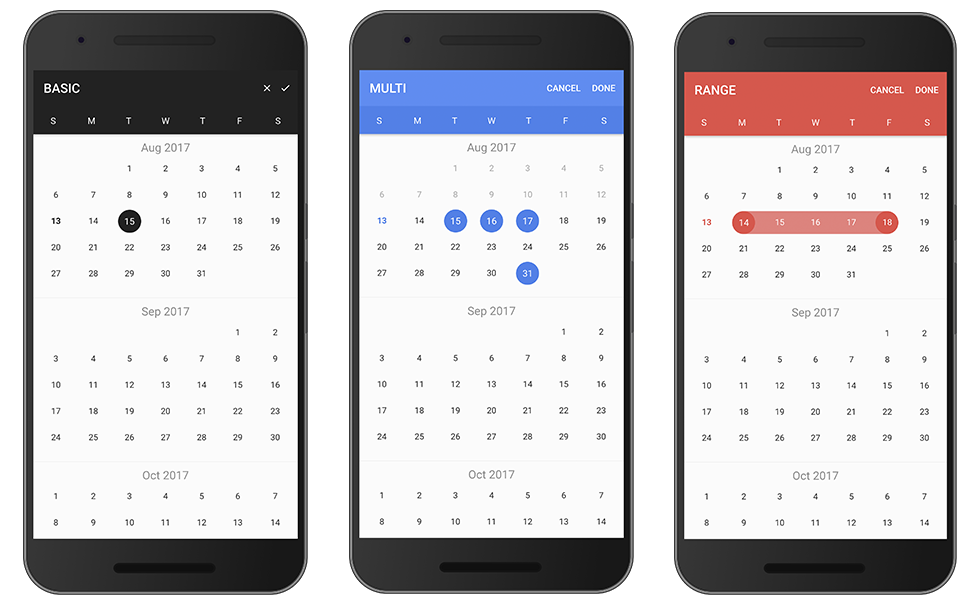
      title: 'BASIC'
    };

    const myCalendar = await this.modalCtrl.create({
      component: CalendarModal,
      componentProps: { options }
    });

    myCalendar.present();

    const event: any = await myCalendar.onDidDismiss();
    const date: CalendarResult = event.data;
    console.log(date);
  }
}
Set pickMode to 'range'.
openCalendar() {
  const options: CalendarModalOptions = {
    pickMode: 'range',
    title: 'RANGE'
  };

  const myCalendar = await this.modalCtrl.create({
    component: CalendarModal,
    componentProps: { options }
  });

  myCalendar.present();

  const event: any = await myCalendar.onDidDismiss();
  const date = event.data;
  const from: CalendarResult = date.from;
  const to: CalendarResult = date.to;

  console.log(date, from, to);
}
Set pickMode to 'multi'.
openCalendar() {
  const options = {
    pickMode: 'multi',
    title: 'MULTI'
  };

  const myCalendar = await this.modalCtrl.create({
    component: CalendarModal,
    componentProps: { options }
  });

  myCalendar.present();

  const event: any = await myCalendar.onDidDismiss();
  const date: CalendarResult = event.data;
  console.log(date);
}
Use index eg: [0, 6] denote Sunday and Saturday.
openCalendar() {
  const options: CalendarModalOptions = {
    disableWeeks: [0, 6]
  };

  const myCalendar = await this.modalCtrl.create({
    component: CalendarModal,
    componentProps: { options }
  });

  myCalendar.present();

  const event: any = await myCalendar.onDidDismiss();
  const date: CalendarResult = event.data;
  console.log(date);
}
your root module
import { NgModule, LOCALE_ID } from '@angular/core';
...

@NgModule({
  ...
  providers: [{ provide: LOCALE_ID, useValue: "zh-CN" }]
})

...
openCalendar() {
  const options: CalendarModalOptions = {
    monthFormat: 'YYYY 年 MM 月 ',
    weekdays: ['天', '一', '二', '三', '四', '五', '六'],
    weekStart: 1,
    defaultDate: new Date()
  };

  const myCalendar = await this.modalCtrl.create({
    component: CalendarModal,
    componentProps: { options }
  });

  myCalendar.present();

  const event: any = await myCalendar.onDidDismiss();
  const date: CalendarResult = event.data;
  console.log(date);
}
Configure one day.
openCalendar() {
  let _daysConfig: DayConfig[] = [];
  for (let i = 0; i < 31; i++) {
    _daysConfig.push({
      date: new Date(2017, 0, i + 1),
      subTitle: `$${i + 1}`
    })
  }

  const options: CalendarModalOptions = {
    from: new Date(2017, 0, 1),
    to: new Date(2017, 11.1),
    daysConfig: _daysConfig
  };

  const myCalendar = await this.modalCtrl.create({
    component: CalendarModal,
    componentProps: { options }
  });

  myCalendar.present();

  const event: any = await myCalendar.onDidDismiss();
  const date: CalendarResult = event.data;
  console.log(date);
}
| Name | Type | Default | Description |
|---|---|---|---|
| from | Date | new Date() |
start date |
| to | Date | 0 (Infinite) | end date |
| title | string | 'CALENDAR' |
title |
| color | string | 'primary' |
'primary', 'secondary', 'danger', 'light', 'dark' |
| defaultScrollTo | Date | none | let the view scroll to the default date |
| defaultDate | Date | none | default date data, apply to single |
| defaultDates | Array | none | default dates data, apply to multi |
| defaultDateRange | { from: Date, to: Date } | none | default date-range data, apply to range |
| defaultTitle | string | '' | default title in days |
| defaultSubtitle | string | '' | default subtitle in days |
| cssClass | string | '' |
Additional classes for custom styles, separated by spaces. |
| canBackwardsSelected | boolean | false |
can backwards selected |
| pickMode | string | single |
'multi', 'range', 'single' |
| disableWeeks | Array | [] |
week to be disabled (0-6) |
| closeLabel | string | CANCEL |
cancel button label |
| doneLabel | string | DONE |
done button label |
| clearLabel | string | null | clear button label |
| closeIcon | boolean | false |
show cancel button icon |
| doneIcon | boolean | false |
show done button icon |
| monthFormat | string | 'MMM YYYY' |
month title format |
| weekdays | Array | ['S', 'M', 'T', 'W', 'T', 'F', 'S'] |
weeks text |
| weekStart | number | 0 (0 or 1) |
set week start day |
| daysConfig | Array<DaysConfig> | [] |
days configuration |
| step | number | 12 |
month load stepping interval to when scroll |
| defaultEndDateToStartDate | boolean | false |
makes the end date optional, will default it to the start |
{ data } = event| pickMode | Type |
|---|---|
| single | { date: CalendarResult } |
| range | { from: CalendarResult, to: CalendarResult } |
| multi | Array<CalendarResult> |
{ role } = event| Value | Description |
|---|---|
| 'cancel' | dismissed by click the cancel button |
| 'done' | dismissed by click the done button |
| 'backdrop' | dismissed by click the backdrop |
| Name | Type | Default | Description |
|---|---|---|---|
| cssClass | string | '' |
separated by spaces |
| date | Date | required | configured days |
| marked | boolean | false | highlight color |
| disable | boolean | false | disable |
| title | string | none | displayed title eg: 'today' |
| subTitle | string | none | subTitle subTitle eg: 'New Year\'s' |
| Name | Type |
|---|---|
| time | number |
| unix | number |
| dateObj | Date |
| string | string |
| years | number |
| months | number |
| date | number |
more like this
Widgets for Douban and Trakt watchlists plus personalized recommendations, live TV streaming including PlutoTV, Yatu ra…
A lightweight, simplified, RedNotebook-inspired journal/diary app. Built with Electron. Makes dated text files.
View and plan your life in an online calendar by visually by seeing it from days to decades
The project aims to replace any (legacy) MS-Windows components with open source counterparts.
search projects, people, and tags