ForwardWidgets
Widgets for Douban and Trakt watchlists plus personalized recommendations, live TV streaming including PlutoTV, Yatu ra…
JavaScript★ 247
Calendar widget for flutter that is swipeable horizontally. This widget can help you build your own calendar widget hig…
 hyochan
git clone https://github.com/hyochan/flutter_calendar_carousel.githyochan/flutter_calendar_carousel

Calendar widget for flutter that is swipeable horizontally. This widget can help you build your own calendar widget highly customizable. Now you can even add your icon for each event.
This widget is compatible with flutter V3 from version 2.4.+.
[2.0.3]
Multiple days selection using addRange method #285
Check out great feature customDayBuilder work done by maxgmer 🎉.
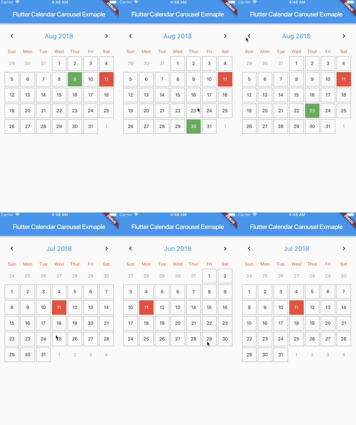

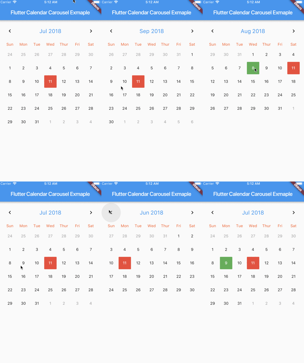
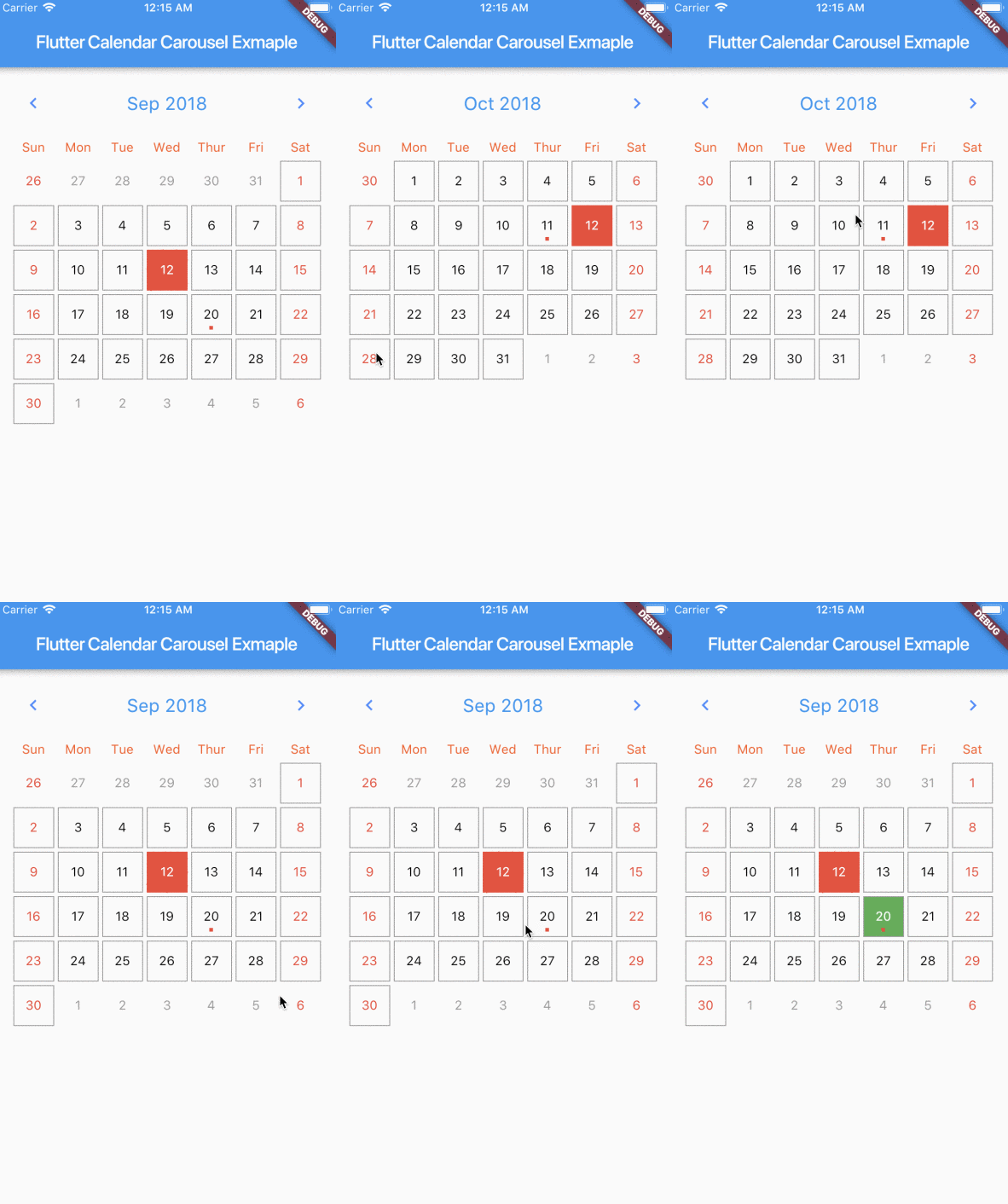
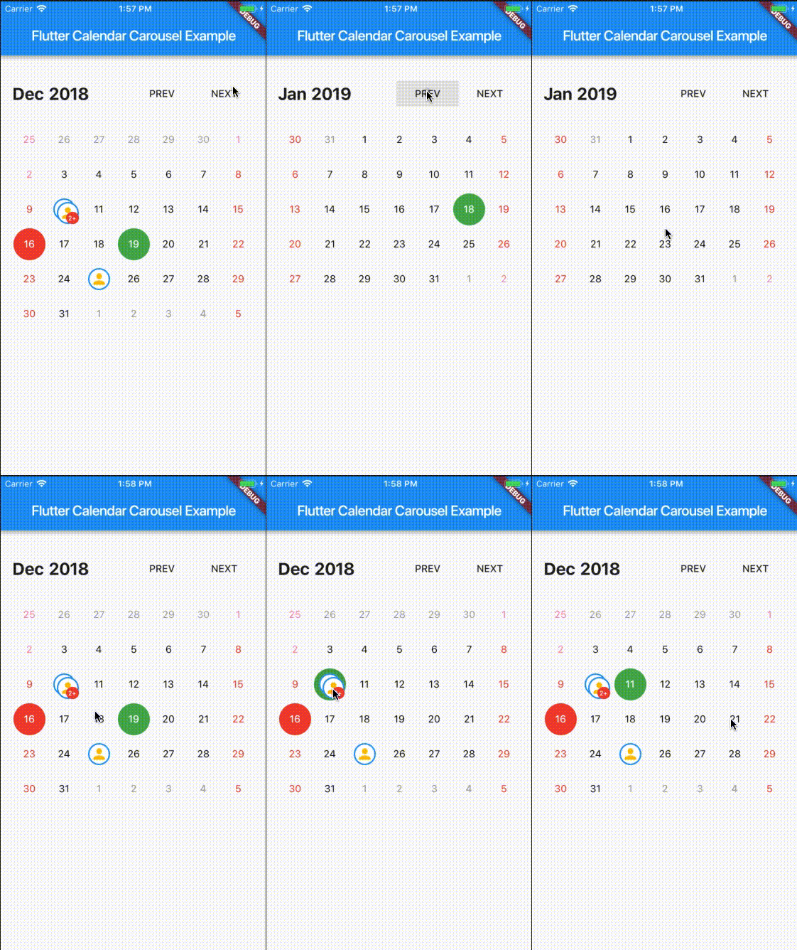
For help getting started with Flutter, view our online documentation.
| props | types | defaultValues |
|---|---|---|
| viewPortFraction | double |
1.0 |
| prevDaysTextStyle | TextStyle |
|
| daysTextStyle | TextStyle |
|
| nextDaysTextStyle | TextStyle |
|
| prevMonthDayBorderColor | Color |
Colors.transparent |
| thisMonthDayBorderColor | Color |
Colors.transparent |
| nextMonthDayBorderColor | Color |
Colors.transparent |
| dayPadding | double |
2.0 |
| height | double |
double.infinity |
| width | double |
double.infinity |
| todayTextStyle | TextStyle |
fontSize: 14.0, color: Colors.white |
| dayButtonColor | Color |
Colors.red |
| todayBorderColor | Color |
Colors.red |
| todayButtonColor | Colors |
Colors.red |
| selectedDateTime | DateTime |
|
| selectedDayTextStyle | TextStyle |
fontSize: 14.0, color: Colors.white |
| selectedDayBorderColor | Color |
Colors.green |
| selectedDayButtonColor | Color |
Colors.green |
| daysHaveCircularBorder | bool |
|
| onDayPressed | Func |
|
| weekdayTextStyle | TextStyle |
fontSize: 14.0, color: Colors.deepOrange |
| iconColor | Color |
Colors.blueAccent |
| headerTextStyle | TextStyle |
fontSize: 20.0, color: Colors.blue |
| headerText | Text |
Text('${DateFormat.yMMM().format(this._dates[1])}') |
| weekendTextStyle | TextStyle |
fontSize: 14.0, color: Colors.pinkAccent |
| markedDatesMap | Events |
null |
| markedDateWidget | Widget |
Positioned(child: Container(color: Colors.blueAccent, height: 4.0, width: 4.0), bottom: 4.0, left: 18.0); |
| markedDateShowIcon | bool |
false |
| markedDateIconBorderColor | Color |
|
| markedDateIconMaxShown | int |
2 |
| markedDateIconMargin | double |
5.0 |
| markedDateIconBuilder | MarkedDateIconBuilder<T> |
|
| markedDateIconOffset | double |
5.0 |
| markedDateCustomShapeBorder | ShapeBorder |
null |
| markedDateCustomTextStyle | TextStyle |
null |
| markedDateMoreCustomDecoration | Decoration |
|
| markedDateMoreCustomTextStyle | TextStyle |
|
| headerMargin | EdgetInsets |
const EdgeInsets.symmetric(vertical: 16.0) |
| headerTitleTouchable | bool |
false |
| onHeaderTitlePressed | Function |
() => _selectDateFromPicker() |
| showHeader | bool |
|
| showHeaderButton | bool |
|
| childAspectRatio | double |
1.0 |
| weekDayMargin | EdgeInsets |
const EdgeInsets.only(bottom: 4.0) |
| weekFormat | bool |
false |
| locale | String |
en |
| firstDayOfWeek | int |
null |
| onCalendarChanged | Function(DateTime) |
|
| minSelectedDate | DateTime |
|
| maxSelectedDate | DateTime |
|
| inactiveDaysTextStyle | TextStyle |
|
| inactiveWeekendTextStyle | TextStyle |
|
| weekDayFormat | WeekdayFormat |
short |
| staticSixWeekFormat | bool |
false |
| showOnlyCurrentMonthDate | bool |
false |
| dayCrossAxisAlignment | CrossAxisAlignment |
CrossAxisAlignment.center |
| dayMainAxisAlignment | MainAxisAlignment |
CrossAlignment.center |
| showIconBehindDayText | bool |
false |
| pageScrollPhysics | ScrollPhysics |
ScrollPhysics |
With CalendarCarousel<YourEventClass> and EventList<YourEventClass> you can specifiy a custom Event class.
Add flutter_calendar_carousel as a dependency in pubspec.yaml
For help on adding as a dependency, view the documentation.
import 'package:flutter_calendar_carousel/flutter_calendar_carousel.dart' show CalendarCarousel;
Widget widget() {
  return Container(
    margin: EdgeInsets.symmetric(horizontal: 16.0),
    child: CalendarCarousel<Event>(
      onDayPressed: (DateTime date, List<Event> events) {
        this.setState(() => _currentDate = date);
      },
      weekendTextStyle: TextStyle(
        color: Colors.red,
      ),
      thisMonthDayBorderColor: Colors.grey,
//      weekDays: null, /// for pass null when you do not want to render weekDays
//      headerText: Container( /// Example for rendering custom header
//        child: Text('Custom Header'),
//      ),
      customDayBuilder: (   /// you can provide your own build function to make custom day containers
        bool isSelectable,
        int index,
        bool isSelectedDay,
        bool isToday,
        bool isPrevMonthDay,
        TextStyle textStyle,
        bool isNextMonthDay,
        bool isThisMonthDay,
        DateTime day,
      ) {
          /// If you return null, [CalendarCarousel] will build container for current [day] with default function.
          /// This way you can build custom containers for specific days only, leaving rest as default.

          // Example: every 15th of month, we have a flight, we can place an icon in the container like that:
          if (day.day == 15) {
            return Center(
              child: Icon(Icons.local_airport),
            );
          } else {
            return null;
          }
      },
      weekFormat: false,
      markedDatesMap: _markedDateMap,
      height: 420.0,
      selectedDateTime: _currentDate,
      daysHaveCircularBorder: false, /// null for not rendering any border, true for circular border, false for rectangular border
    ),
  );
}
I've been maintaining quite many repos these days and burning out slowly. If you could help me cheer up, buying me a cup of coffee will make my life really happy and get much energy out of it.
more like this
Widgets for Douban and Trakt watchlists plus personalized recommendations, live TV streaming including PlutoTV, Yatu ra…
Habit Tracker helps you build positive habits and keeps track of your day-to-day habits and routines. Made with Clean a…
search projects, people, and tags