EspHoMaTriXv2
A simple DIY status display with a 8x32 RGB LED matrix, implemented with esphome.io and Home Assistant.
 lubeda
git clone https://github.com/lubeda/EspHoMaTriXv2.gitlubeda/EspHoMaTriXv2EspHoMaTriX version 2 (EHMTXv2)

Tip
If you like this project, please donate a star on GitHub and consider sponsoring me 🙏 !
Advice
Always use the latest version of this tool and use it directly from the repo, like this:
external_components:
  - source:
      type: git
      url: https://github.com/lubeda/EspHoMaTriXv2
      ref: 2026.7.1
    refresh: 60s
    components: [ ehmtxv2 ]
Use the ref parameter to select the right version. But when there are breaking changes in ESPHome you have to expect breaking changes in EspHoMaTriX too (at least some funny workarounds)
Introduction
EspHoMaTriXv2 is a flexible, highly customizable DIY LED Matrix display, built with a 8×32 RGB LED panel and implemented with esphome.io
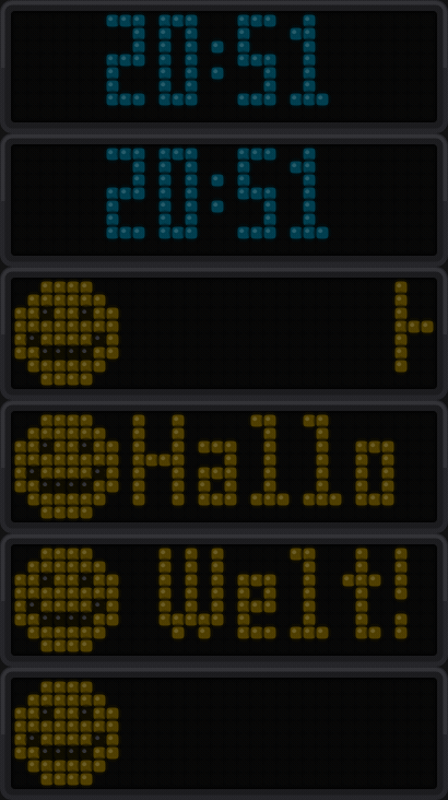
You can control it with Home Assistant using service calls or by using lambda with ESPHome.
For a quick start, see the Quick Start Guide.
How to install
For starters, I assume you use an Ulanzi TC001 pixel clock. For tinkerers and people that want more, read the For experienced user part.
- Copy all two files (ulanzi-easy.yaml, MatrixChunky6.ttf) from the
installfolder to your ESPHome folder. - Define your secret settings (OTA password, Wi-Fi settings) in the secrets.yaml file or with the ESPHome UI.
- Define the weekdays variable for your language (see parameters).
- Install it via USB and the device should boot.

and after a while (~30 seconds) it should display the correct time.
Overview
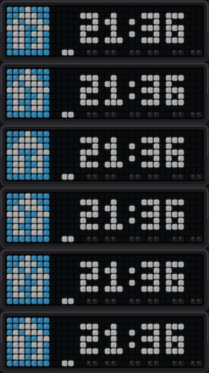
The base file is configured to show a clock with the day of the month over a calendar icon:

Or use animated icons as you like
Then, you can add screens to a queue and all these screens are displayed one after another.
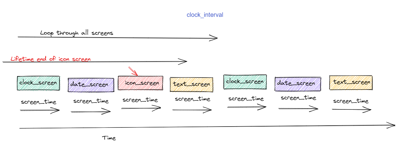 Each screen can display different information or an animation or text, even in rainbow color. They all have a lifetime, if a screen isn't refreshed during its lifetime it will be removed from the queue. If there is nothing left in the queue, the time screen is displayed.
Some screens can show additional display elements:

The alarm is in the upper-right corner (red)
The rindicator is in the lower-right corner (yellow)
The lindicator is in the lower-left corner (yellow)
You can add/remove/emphasize screens and toggle elements from Home Assistant with service-calls or from ESPHome via lambdas in your YAML (see API reference).
There are some preinstalled icons in the YAML, so you can easily start showing information on your display with Home Assistant service calls.
Screen types
The following screen types are available:
Normal icon screen
This is the regular screen, designed to show an icon and text aside.
The example below shows the icon "solar" icon_name with the scrolling text text "sun is shining" for 10 seconds screen_time in a queue with all the other screens in the queue; after 2 minutes of lifetime it disappears from the queue. The text color (r,g,b) is specified with RGB values. The display decides when to display this screen depending on the queue.
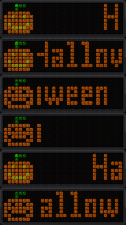
Example Home Assistant service call:
service: esphome.ulanzi_icon_screen
data:
  default_font: true
  icon_name: pumkin
  text: Halloween
  lifetime: 2
  screen_time: 10
  r: 255
  g: 165
  b: 0
Alert icon screen
Occasionally, you have to display information immediately; this one does not have a lifetime parameter:
service: esphome.ulanzi_alert_screen
data:
  default_font: true
  icon_name: home_assistant
  text: What a great software!
  screen_time: 10
  r: 20
  g: 180
  b: 240
For funny colors, there is also a service: esphome.ulanzi_rainbow_alert_screen
Rainbow icon screen
This shows the icon "solar" icon_name with the scrolling text text "sun is shining" for 10 seconds screen_time in a queue with all the other screens in the queue, after 2 minutes lifetime it disappears from the queue. The text color changes automatically. The display decides when to display this screen depending on the queue.
Example Home Assistant service call:
service: esphome.ulanzi_rainbow_icon_screen
data:
  default_font: true
  icon_name: solar
  text: sun is shining
  lifetime: 2
  screen_time: 10
Progress screen
To visualize e.g., a print progress you can use:
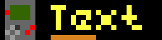
service: esphome.ulanzi_icon_screen_progress
data:
  default_font: true
  icon_name: print3d
  text: 67% done
  progress: 67
  lifetime: 2
  screen_time: 9
  r: 200
  g: 200
  b: 200
A positive progress value is getting greener on its way to 100 a negative value is going to red.
Text-only screen
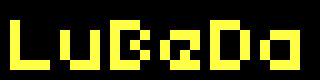
service: esphome.ulanzi_text_screen
data:
  default_font: true
  text: What a long text
  lifetime: 2
  screen_time: 10
  r: 200
  g: 200
  b: 200
Same with rainbow-colored text esphome.ulanzi_rainbow_text_screen
Combined icons screen
Try this and enjoy the cool animations.

service: esphome.ulanzi_bitmap_stack
data:
  icons: solar,power,temp,error
  lifetime: 2
  screen_time: 10
Blank screen
Try this:
service: esphome.ulanzi_blank_screen
data:
  lifetime: 2
  screen_time: 120
These were only static examples, in your automations you can customize a lot more. See the upcoming chapter for more possibilities.
Removing a screen from the queue
If you added e.g. an icon screen (MODE_ICON_SCREEN which is 5, see modes) with icon power, just call:
service: esphome.ulanzi_del_screen
data:
  icon_name: "power"
  mode: 5
If you want to remove a screen generated with the service: esphome.ulanzi_blank_screen, you can do this via:
service: esphome.ulanzi_del_screen
data:
  icon_name: "*"
  mode: 1
Since a blank screen has no icon, you have to use "*" as icon_name.
Emphasizing a specific screen
To show one of the screens from the queue right now, use:
service: esphome.ulanzi_force_screen
data:
  icon_name: "solar"
  mode: 5
For experienced users
Icons and Animations
Download and install all needed icons (.jpg/.png) and animations (.GIF) under the ehmtxv2: key. All icons have to be 8x8 or 8x32 pixels in size. If necessary, you can scale them with the option resize: 8x8 or resize: 32x8.
Tip
To easily convert your own images into the required RGB565 format for use in your YAML, you can use the built-in EHMTX Bitmap Converter tool. Just open it in your browser!
Pro user should use gimp.
You can also specify a URL to directly download the image file. The URLs will only be downloaded once at compile time, so there is no additional traffic on the hosting website.
All other solutions provide ready-made icons, especially Lametric has a big database of icons. If you find an icon, you can use it with its ID. e.g., lameid: 1234 Please, check the copyright of the icons you use. The maximum number of icons is limited to 90 in the code and also by the flash space and the RAM of your board.
Sample
emhtx:
  icons:
    - id: boot
      file: icons/rocket.GIF
      duration: 75
    - id: temp
      lameid: 1234
    - id: yoga
      file: icons/yoga-bridge.GIF
      pingpong: true
    - id: jackshome
      url: https://awtrix.blueforcer.de/animations/JackHomePage
      resize: 32x8
    - id: garage
      lameid: 1234
      duration: 100
    - id: homeassistant
      url: https://github.com/home-assistant/assets/raw/master/logo/logo-special.png
The ID of the icons is used later to configure the screens to display. So, you should name them wisely. If you like to group icons, you should prefix them, e.g., with “weather_”.
The first defined icon will be used as a fallback icon, in case of an error, e.g., if you use a non-existing icon ID.
There are some more advanced parameters
Fonts
In the easy configuration is one TTF-font from Trip5 included.
You can configure two fonts if you like.
The font needs to be readable on a matrix display. I use a font with 6 pixels height and one with 8 Pixel height. The 6px font is my default on all screens, with a progress bar or the day of week lower line.
Some people use a “normal” font from Trip5 and another for Cyrillic, Korean or Hebrew letters. For the RTL based users, take a look at bidi from @iodov to enhance the readability.
@dbuezas has also contributed tow optimized fonts with umlauts for this kind of display mateine.ttf and mateineThin.ttf see here.
font:
  - file: mateine.ttf
    id: default_font
    size: 16
    glyphs:  |
      !"%()+*=,-_.:°0123456789ABCDEFGHIJKLMNOPQRSTUVWXYZ abcdefghijklmnopqrstuvwxyz€@
You find my first attempt to adapt a font also in the resources-folder.
Configuration
This component is highly customizable.
Example
ehmtxv2:
  id: rgb8x32
  show_seconds: true
  advanced_clock: false
  matrix_component: ehmtx_display
  time_component: ehmtx_time
  icons2html: true
  iconscache: true
  default_font_id: default_font
  default_font_yoffset: 6
  special_font_id: special_font
  special_font_yoffset: 7
  brightness: 80 # percent
  time_format: "%H:%M"
  date_format: "%d.%m."
  rtl: false # write vom left to right
  vertical_scroll: false
  week_start_monday: true # false equals sunday
  scroll_count: 2 # scroll long text at least two times
  scroll_interval: 80 # milliseconds
  rainbow_interval: 32 # milliseconds
  icons:
  .....
Parameters reference
id (required, ID): Manually specify the ID used for code generation and in service definitions.
date_format (optional, string): formats the date display with strftime syntax, defaults "%d.%m." (use "%m.%d." for the US)
show_seconds (optional, boolean): toggle/blink an indicator-pixel each seconds while the clock is displayed (default: false)
time_format (optional, string): formats the time display with strftime syntax, defaults "%H:%M" (use "%I:%M%p" for the US)
default_font_yoffset (optional, pixel): yoffset the text is aligned BASELINE_LEFT, the baseline defaults to 6
default_font_xoffset (optional, pixel): xoffset the text is aligned BASELINE_LEFT, the left defaults to 1
special_font_yoffset (optional, pixel): yoffset the text is aligned BASELINE_LEFT, the baseline defaults to 6
special_font_xoffset (optional, pixel): xoffset the text is aligned BASELINE_LEFT, the left defaults to 1
scroll_small_text (optional, boolean): normally small text is centered on the display if possible, with this set to true even small text is scrolled in text_screen and rainbow_text_screen (default: false)
matrix_component (required, ID): ID of the addressable display
show_dow (optional, boolean): draw the day of week rindicator on the bottom of the clock screen. Disable, e.g., if you want larger fonts, defaults to true.
time_component (required, ID): ID of the time component. The display shows !t! until the time source is valid.
default_font (required, ID): ID of the default font
special_font (required, ID): ID of the special font, you can reuse your default font, but occasionally, it's nice to have a special font to minimize scrolling
week_start_monday (optional, boolean): default Monday is first day of week, false => Sunday
weekdays (optional, string, default: "SUMOTUWETHFRSA"): Abbreviations of the days of the week, starting from Sunday, from 7 to 14 characters.
Example:
weekdays: "SUMOTUWETHFRSA"weekdays: "일월화수목금토"weekdays: "НДПНВТСРЧТПТСБ"weekdays: "DiLuMaMeJeVeSa" # french
scroll_interval (optional, ms): the interval in ms to scroll the text (default=80), should be a multiple of the update_interval of display
rainbow_shimmer (optional, boolean): If true, enables color shimmer when displaying text in rainbow modes.
multicolor_text (optional, boolean): If true, enables text multi color support when displaying text.
Example:
ehmtxv2:
  id: rgb8x32
...
  multicolor_text: true
service: esphome.ulanzi_text_screen
data:
  default_font: true
  text: "Default Color Text #00FF00Green Color Text #FF0000Red Color Text #0000FFBlue Color Text #000000Default Color Text"
  lifetime: 2
  screen_time: 10
  r: 255
  g: 255
  b: 255
Shows text in different colors, Default Color Text in the default color #FFFFFF (r: 255, g:255, b: 255), followed by Green Color Text in green #00FF00, then Red Color Text in red #FF0000, then Blue Color Text in blue #0000FF and finally Default Color Text in default color, due #000000.
Warning
In this mode, with a large number of color changes, or with long lines, a short-term decrease in performance is possible.
[13:26:02][W][component:237]: Component display took a long time for an operation (55 ms).
[13:26:02][W][component:238]: Components should block for at most 30 ms.
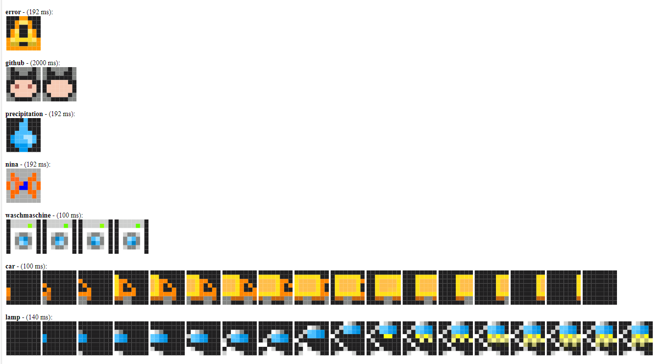
icons2html (optional, boolean): If true, generate the HTML-file (filename.html) to show all included icons. (default = false)
iconscache (optional, boolean): If true, it caches icons in the .cache\icons folder and if it finds the specified icons in the cache, it uses them instead of trying to download them again from the Internet. (default = false)
right_center_indicator (optional, boolean, default: false): Controls the ability to use the right center indicator.
right_bottom_indicator (optional, boolean, default: true): Controls the ability to use the right bottom indicator.
left_top_indicator (optional, boolean, default: false): Controls the ability to use the left top indicator.
left_center_indicator (optional, boolean, default: false): Controls the ability to use the left center indicator.
left_bottom_indicator (optional, boolean, default: true): Controls the ability to use the left bottom indicator.
icon_indicator (optional, boolean, default: true): Controls the ability to use the icon indicator.
gauge (optional, boolean, default: true): Controls the ability to use the gauge indicator.
fire_screen (optional, boolean, default: true): Controls the ability to use the fire screen.
Modes
| mode | value |
|---|---|
| MODE_BLANK | 1 |
| MODE_CLOCK | 2 |
| MODE_DATE | 3 |
| MODE_FULL_SCREEN | 4 |
| MODE_ICON_SCREEN | 5 |
| MODE_TEXT_SCREEN | 6 |
| MODE_RAINBOW_ICON | 7 |
| MODE_RAINBOW_TEXT | 8 |
| MODE_RAINBOW_CLOCK | 9 |
| MODE_RAINBOW_DATE | 10 |
| MODE_BITMAP_SCREEN | 11 |
| MODE_BITMAP_SMALL | 12 |
| MODE_COLOR | 13 |
| MODE_FIRE | 14 |
| MODE_ICON_CLOCK | 15 |
| MODE_ALERT_SCREEN | 16 |
| MODE_GRAPH_SCREEN | 17 |
| MODE_ICON_DATE | 18 |
| MODE_ICON_PROGRESS | 19 |
| MODE_RAINBOW_BITMAP_SMALL | 20 |
| MODE_ICON_TEXT_SCREEN | 21 |
| MODE_RAINBOW_ICON_TEXT_SCREEN | 22 |
| MODE_BITMAP_STACK_SCREEN | 23 |
| MODE_TEXT_PROGRESS | 24 |
| MODE_PROGNOSIS_SCREEN | 25 |
| MODE_RAINBOW_ALERT_SCREEN | 26 |
| MODE_ALERT_TEXT_SCREEN | 27 |
More details, for curious users
Background
There are some “RGB-matrices” status displays/clocks out there, the commercial ones from LaMetric and Ulanzi, also some excellent DIY-alternatives.
- LaMetric commercial ~ €199
- Ulanzi TC001 commercial ~ €50
- AWTRIX (project has been discontinued after more than 4 years in August 2022)
- PixelIt (project is under active development)
- Pixelix controlled via REST API or Websocket
- AWTRIX-Light From the developer of AWTRIX, optimized for the Ulanzi TC001 hardware
All the various solutions have their pros and cons. I tried some and used AWTRIX for a long time, but I found it lacking in many ways (in my opinion), so I started work on an ESPHome variant. Targeted for an optimized and extensible Home Assistant integration without paid blueprints, MQTT broker requirement, or the need to upload files to the ESP board.
Warning
Some updates of ESPHome will interfere with EspHoMaTriXv2, like the update of ESPHome to 2023.7.0. It made a change to all YAML files necessary.
You have also to copy the file 1pixel.gif from the installation folder to the ESPHome directory with your YAML.
Also, there might be breaking changes due to a redesign of EspHoMaTriXv2.
Tip
It is highly recommended to use an ESP32 device. There are conditions where the RAM size is too limited in an ESP8266 device so some features had to be removed for these boards (Example: bitmap_screen).
API
Home Assistant services
There are many services and parameters to use, some are only available on ESP32-platform due to resource limitations.
You can call this from, e.g., the developer tools service.
  get_status
  set_display_on
  set_display_off
  hold_screen
  hide_rindicator
  hide_lindicator
  hide_gauge
  hide_alarm
  night_mode_on
  night_mode_off
  set_weekday_accent_on
  set_weekday_accent_off
  hide_icon_indicator
  show_gauge {"percent", "r", "g", "b", "bg_r", "bg_g", "bg_b"});
  show_alarm {"r", "g", "b", "size"}
  show_rcindicator {"r", "g", "b", "size"}
  show_rindicator {"r", "g", "b", "size"}
  show_lindicator {"r", "g", "b", "size"}
  show_ltindicator {"r", "g", "b", "size"}
  show_lcindicator {"r", "g", "b", "size"}

  set_today_color {"r", "g", "b"}
  set_weekday_color {"r", "g", "b"}
  set_clock_color {"r", "g", "b"}
  set_text_color {"r", "g", "b"}
  set_infotext_color {"left_r", "left_g", "left_b", "right_r", "right_g", "right_b", "default_font", "y_offset"}
  expand_icon_to_9 {"mode"}

  set_solid_color {"r", "g", "b"}
  set_calendar_color {"r", "g", "b"}

  del_screen {"icon_name", "mode"}
  force_screen {"icon_name", "mode"}

  full_screen {"icon_name", "lifetime", "screen_time"}
  icon_screen {"icon_name", "text", "lifetime", "screen_time", "default_font", "r", "g", "b"}
  alert_screen {"icon_name","text", "screen_time", "default_font", "r", "g", "b"}
  rainbow_alert_screen {"icon_name","text", "screen_time", "default_font"}
  icon_clock {"icon_name", "lifetime", "screen_time", "default_font", "r", "g", "b"}
  icon_date {"icon_name", "lifetime", "screen_time", "default_font", "r", "g", "b"}

  graph_screen {"lifetime", "screen_time"}
  icon_graph_screen {"icon_name", "lifetime", "screen_time"}

  rainbow_icon_screen {"icon_name", "text", "lifetime", "screen_time", "default_font"}

  icon_text_screen {"icon_name", "text", "lifetime", "screen_time", "default_font", "r", "g", "b"}
  rainbow_icon_text_screen {"icon_name", "text", "lifetime", "screen_time", "default_font"}

  text_screen {"text", "lifetime", "screen_time", "default_font", "r", "g", "b"}
  rainbow_text_screen {"text", "lifetime", "screen_time", "default_font"}
  alert_text_screen {"text", "screen_time", "default_font", "r", "g", "b"}

  clock_screen {"lifetime", "screen_time", "default_font", "r", "g", "b"}

  rainbow_clock_screen {"lifetime", "screen_time", "default_font"}

  date_screen {"lifetime", "screen_time", "default_font", "r", "g", "b"}
  rainbow_date_screen {"lifetime", "screen_time", "default_font"}

  blank_screen {"lifetime", "screen_time"}
  color_screen {"lifetime", "screen_time", "r", "g", "b"}

  brightness {"value"}

  color_gauge {"colors"}
  bitmap_screen {"icon", "lifetime", "screen_time"}
  bitmap_small {"icon", "text", "lifetime", "screen_time", "default_font", "r", "g", "b"}
  rainbow_bitmap_small {"icon", "text", "lifetime", "screen_time", "default_font"}
  bitmap_stack {"icons", "lifetime", "screen_time"}

  show_icon_indicator {"r", "g", "b", "size", "pos", "height"}

  fire_screen {"lifetime", "screen_time"}

  set_clock_infotext_color {"left_r", "left_g", "left_b", "right_r", "right_g", "right_b", "default_font", "y_offset"}
  set_date_infotext_color {"left_r", "left_g", "left_b", "right_r", "right_g", "right_b", "default_font", "y_offset"}
  set_adv_clock_color {"hr", "hg", "hb", "mr", "mg", "mb", "sr", "sg", "sb"}

  text_screen_progress {"text", "value", "progress", "lifetime", "screen_time", "default_font", "value_color_as_progress", "r", "g", "b"}
  icon_screen_progress {"icon_name", "text", "progress", "lifetime", "screen_time", "default_font", "r", "g", "b"}
  set_progressbar_color {"icon_name", "mode", "r", "g", "b", "bg_r", "bg_g", "bg_b"}

  icon_prognosis_screen {"icon_name", "text", "prognosis", "lifetime", "screen_time", "default_font"}
  icon_prognosis_screen_rgb {"icon_name", "text", "prognosis", "lifetime", "screen_time", "default_font", "r", "g", "b"}
[hint] The rainbow_* variants don't display the day of week bar.
Lambda
You can use the above functions also in lambdas in your ESPHome YAML.
all parameters have a default value.
void clock_screen(int lifetime=D_LIFETIME, int screen_time=D_SCREEN_TIME,bool default_font=true,int r=C_RED, int g=C_GREEN, int b=C_BLUE);
void rainbow_clock_screen(int lifetime=D_LIFETIME, int screen_time=D_SCREEN_TIME, bool default_font=true);
void date_screen(int lifetime=D_LIFETIME, int screen_time=D_SCREEN_TIME,bool default_font=true, int r=C_RED, int g=C_GREEN, int b=C_BLUE);
Icon screen
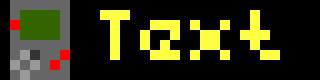
Service via API
icon_screen => {"icon_name", "text", "lifetime", "screen_time", "default_font", "r", "g", "b"}
rainbow_icon_screen => {"icon_name", "text", "lifetime", "screen_time", "default_font"}
alert_screen => {"icon_name","text", "screen_time", "default_font", "r", "g", "b"}
Lambda
void icon_screen(std::string icon, std::string text, int lifetime=D_LIFETIME, int screen_time=D_SCREEN_TIME,bool default_font=true,int r=C_RED, int g=C_GREEN, int b=C_BLUE);
void rainbow_icon_screen(std::string icon, std::string text, int lifetime=D_LIFETIME, int screen_time=D_SCREEN_TIME,bool default_font=true);
void alert_screen(std::string icon_name, std::string text, int screen_time, bool default_font, int r, int g, int b)
icon_screen and rainbow_icon_screen are in the queue for lifetime minutes. alert_screen and rainbow_alert_screen is displayed once, immediately for at least screentime seconds. For long text, the screentime is calculated automagically.
Full_screen
For 8x32 icons or animations

Service via API
full_screen => {"icon_name", "lifetime", "screen_time"}
Lambda
void full_screen(string iconname, int =D_LIFETIME, int screen_time=D_SCREEN_TIME);
Icon clock
display the clock with an icon. the time format an the show_dow are the same as the normal clock. take care of the font size, the time should not need more then 23 pixels width.
Service via API
icon_clock => {"icon_name", "lifetime", "screen_time", "default_font", "r", "g", "b"});
Lambda
void icon_clock(std::string iconname, int lifetime, int screen_time, bool default_font, int r, int g, int b)
Bitmap screen
Warning
This feature is only available on ESP32 platform !!!
For 8x32 images as text. You can generate these images with, e.g., Pixel Bitmap Creator (8x32) or just open the EHMTX Bitmap Converter (in the resources-folder) in your browser and select the images you want. This tool will automatically scale and convert your images into the correct RGB565 format for the bitmap_screen service.
Service via API
bitmap_screen => {"[0,4523,0,2342,0,..... (256 values 16bit values rgb565)]", "lifetime", "screen_time"}
Lambda
void bitmap_screen(string text, int =D_LIFETIME, int screen_time=D_SCREEN_TIME);
Display Elements
Alarm
The alarm is displayed in the upper-right corner on all screen types! You can set its color and its size.
Home Assistant Service
show_alarm => { "r", "g", "b","size"}
To remove it, call:
hide_alarm => no parameter
Lambda
void EHMTX::show_alarm(int r, int g, int b, int size=2);
r, g, b: 0-255 color components size: 0-3 (zero turns it off)
To remove it, call:
void hide_alarm();
rindicator
The rindicator is in the lower-left corner, but not displayed in full screen 8x32 animations. You can set its color.
Home Assistant Service
show_rindicator => { "r", "g", "b","size"}
To remove it, call:
hide_rindicator => no parameter
Lambda
void show_rindicator(int r, int g, int ,int size=3);
r, g, b: 0-255 color components size: 0-3 (zero turns it off)
To remove it, call:
void hide_rindicator();
lindicator
Same as above but in the lower-left corner, this is not visible while icons are displayed.
gauge
The gauge is displayed in the left most column. You can set its color and its value from 0-100, the resolution is limited to 8 pixels, so it is not a precision gauge.
Home Assistant Service
show_gauge => {"value","r", "g", "b","bg_r", "bg_g", "bg_b"}
To remove it, call:
hide_gauge => no parameter
Lambda
void show_gauge(int percent, int r, int g, int b, int bg_r, int bg_g, int bg_b);
percent: 0-100 (resolution: one pixel per 12.5%) r, g, b: 0-255 foreground color components bg_r, bg_g, bg_b: 0-255 background color components
To remove it, call:
void hide_gauge();
Installation of EspHoMaTriXv2 custom component
EspHoMaTriXv2 is a custom component, you have to include it in your YAML configuration. To always use the newest features, you should use the repo, to use a stable version, you copy a working version to your ESPHome installation.
Use of local copy
If you download the components-folder from the repo and install it in your ESPHome you have a stable installation. But if there are new features, you won't see them. If needed, customize the YAML to your folder structure.
external_components:
   - source:
       type: local
       path: components # e.g. /config/esphome/components
Use from repo
Use the GitHub repo as a component. Esphome refreshes the external components “only” once a day, perhaps you have to refresh it manually. In this mode, there may be breaking changes, so read the changelog and check the logs while installing the firmware.
external_components:
  - source:
      type: git
      url: https://github.com/lubeda/EspHoMaTriXv2
      ref: stable # optional select a special branch or tag
[tip] Use the
refparameter to stay on the feature set you know. Using themainor other version will cause problems with breaking changes. But in case of ESPHome is breaking something i will always only fix the latest version.!
Addressable_light component
The EspHoMaTriXv2 component requires a 8x32 pixel addressable_light, it is referenced by the ID matrix_component.
See the default options
There are some different matrices-types on the market, to adapt them to EspHoMaTriXv2 you have to find the proper pixel mapper. If there is garbage on your display, try the other pixel_mapper. Here are the most common types for flexible 8x32 matrices:
Type 1
Common for 8x32 RGB flexible matrices.
Under the display tag, specify this pixel mapper:
display:
  - platform: addressable_light
    .....
    pixel_mapper: |-
      if (x % 2 == 0) {
        return (x * 8) + y;
      }
      return (x * 8) + (7 - y);
    .....
Type 2 (e.g., Ulanzi TC001)
Under the display tag, specify this pixel mapper:
display:
  - platform: addressable_light
    .....
    pixel_mapper: |-
      if (y % 2 == 0) {
        return (y * 32) + x;
      }
      return (y * 32) + (31 - x);
    .....
Type 3 (daisy-chained 8x8 panels)
display:
  - platform: addressable_light
    .....
    pixel_mapper: |-
      return ((int) (x/8 * 64)) + x % 8 + y * 8;
    .....
How to configure the pixel_mapper
You have to configure this lambda under the display: section to use the EspHoMaTriXv2 component
display:
  - platform: addressable_light
    id: ehmtx_display
    .....
    lambda: |-
      id(rgb8x32)->tick();
      id(rgb8x32)->draw();
Light component
The light component is used by the addressable_light component and referenced by ID under addressable_light_id:.
To use the light component directly from Home Assistant, add the sample lambdason_turn_on and on_turn_off to the light component.
Sample
light:
  - platform: neopixelbus
    id: ehmtx_light
    ....
    on_turn_on:
      lambda: |-
         id(ehmtx_display)->set_enabled(false);
    on_turn_off:
       lambda: |-
         id(ehmtx_display)->set_enabled(true);
To hide the light component in Home Assistant use: internal: true
light:
  - platform: neopixelbus
    id: ehmtx_light
    internal: true
    ...
Time component
Since it is a clock, you need a time component, e.g., Home Assistant. It is referenced by its ID under time_component: The display shows !t! until the time source is synchronized and valid.
ehmtxv2 component
Here are also the more advanced parameters listed
Example
ehmtxv2:
  id: rgb8x32
  show_seconds: true
  advanced_clock: false
  matrix_component: ehmtx_display
  time_component: ehmtx_time
  icons2html: true
  default_font_id: default_font
  .....
Parameters
id (required, ID): Manually specify the ID used for code generation and in service definitions.
date_format (optional, string): formats the date display with strftime syntax, defaults "%d.%m." (use "%m.%d." for the US)
date_format_big (optional, string): formats the date display with strftime syntax, defaults "%d.%m." (use "%m.%d." for the US), works only in advanced_clock mode and sets the time format for a screen with a date without an icon
show_seconds (optional, boolean): toggle/blink an indicator-pixel each seconds while the clock is displayed (default: false)
time_format (optional, string): formats the date display with strftime syntax, defaults "%H:%M" (use "%I:%M%p" for the US)
time_format_big (optional, string): formats the date display with strftime syntax, defaults "%H:%M:%S", works only in advanced_clock mode and sets the time format for a screen with a clock without an icon
advanced_clock (optional, boolean): Enables or disables advanced clock mode. (default: false) You can specify the color for hours,minuted,seconds in RGB separatly:
set_adv_clock_color(hr,hg,hb,mr,mg,mb,sr,sg,sb) More info
flip_flop_clock (optional, boolean): Enables or disables flip_flop_clock clock mode. (default: false), works only in advanced_clock mode.
flip_flop_speed (optional, int): Set flip_flop_clock speed. (default: 2, range 1..10), works only in advanced_clock mode.
advanced_bitmap (optional, boolean): Enables or disables advanced bitmap mode. (default: false) More info
default_font_yoffset (optional, pixel): yoffset the text is aligned BASELINE_LEFT, the baseline defaults to 6
default_font_xoffset (optional, pixel): xoffset the text is aligned BASELINE_LEFT, the left defaults to 1
special_font_yoffset (optional, pixel): yoffset the text is aligned BASELINE_LEFT, the baseline defaults to 6
special_font_xoffset (optional, pixel): xoffset the text is aligned BASELINE_LEFT, the left defaults to 1
scroll_small_text (optional, boolean): normally small text is centered on the display if possible, with this set to true even small text is scrolled in text_screen and rainbow_text_screen (default: false)
rtl (optional, boolean): if true write text (but only the scroll direction, the words, and numbers aren't changed!) from right to left (Arabic, Hebrew etc.). Default is false
vertical_scroll (optional, boolean): If true, the screen change is vertical scrolling. Default is false
matrix_component (required, ID): ID of the addressable display
show_dow (optional, boolean): draw the day of week rindicator on the bottom of the clock screen. Disable, e.g., if you want larger fonts, defaults to true.
blend_steps (optional, int): on screen transition you can blend in the new screen, a value of 16, 32, 64 works nice, defaults 0. The blend_steps is proportionally reduced depending on the brightness, from the maximum specified in the configuration to half its value at a brightness of 50 units. If the brightness is less than 50 units, then the blend_steps is not applied.
time_component (required, ID): ID of the time component. The display shows !t! until the time source is valid.
default_font (required, ID): ID of the default font
special_font (required, ID): ID of the special font, you can reuse your default font, but occasionally, it's nice to have a special font to minimize scrolling
week_start_monday (optional, boolean): default Monday is first day of week, false => Sunday
weekdays (optional, string, default: "SUMOTUWETHFRSA"): Abbreviations of the days of the week, starting from Sunday, from 7 to 14 characters.
Example:
weekdays: "SUMOTUWETHFRSA"weekdays: "일월화수목금토"weekdays: "НДПНВТСРЧТПТСБ"
scroll_interval (optional, ms): the interval in ms to scroll the text (default=80), should be a multiple of the update_interval of the display
clock_interval (optional, s): the interval in seconds to force the clock display. By default, the clock screen, if any, will be displayed according to the position in the queue. If you set the clock_interval close to the screen_time of the clock, you will only see the clock! (default=0)
boot_logo (optional, string , only on ESP32): Display a fullscreen logo defined as rgb565 array for boot_logo_mode 0/1 or a binary array for the other boot_logo_modes
boot_logo: "[0,0,0,0,0,0,0,0,0,0,0,0,0,0,0,0,0,0,0,0,0,0,0,0,0,0,0,0,0,0,0,0,0,63519,63519,63519,63519,0,0,0,0,0,0,0,0,0,0,0,0,0,0,0,0,0,0,0,0,0,0,0,0,0,0,0,0,63519,0,0,0,0,2016,0,0,0,0,0,0,0,0,0,0,31,0,0,0,0,0,0,0,0,0,63488,0,63488,0,0,0,63519,0,0,0,0,2016,2016,0,0,0,65514,0,65514,0,0,0,31,0,0,0,64512,0,0,64512,0,63488,63488,0,63488,63488,0,0,63519,63519,63519,0,0,2016,0,2016,0,65514,0,65514,0,65514,0,31,31,31,0,0,0,64512,64512,0,0,63488,63488,63488,63488,63488,0,0,63519,0,0,0,0,2016,0,2016,0,65514,0,65514,0,65514,0,0,31,0,0,0,0,64512,64512,0,0,0,63488,63488,63488,0,0,0,63519,63519,63519,63519,0,2016,0,2016,0,65514,0,65514,0,65514,0,0,0,31,31,0,64512,0,0,64512,0,0,0,63488,0,0,0,0,0,0,0,0,0,0,0,0,0,0,0,0,0,0,0,0,0,0,0,0,0,0,0,0,0,0,0,0,0,0,0]"
Allows you to show a custom boot logo instead of the default animation when booting. advanced_boot (optional, boolean, only on ESP32, Default: false) Enables advanced mode of boot logo display. boot_logo (optional, string, only on ESP32): Mask defined as rgb565 array used to display boot logo, color is entirely ignored, output depends on boot logo display mode.
boot_logo_mode (optional, integer, only on ESP32, Default: 0) Mode of displaying boot logo, can take value from 0 to 7:
- 0 - Display the boot_logo with the defined colors (default)
- 1 - Display the boot_logo with the defined colors, the logo appears from the center to the sides.
- 2 - Display boot_logo in white color
- 3 - Display boot_logo in white color, the mask appears from the center to the sides.
- 4 - Display boot_logo with rainbow color
- 5 - Display boot_logo in rainbow color, the mask appears from the center to the sides
- 6 - Display boot_logo in white color, in pseudo-animation mode, this mode for true starship astronavigators.
- 7 - Display boot_logo in rainbow color, in pseudo-animation mode, this mode for true starship astronavigators.
Mode 3 is best used with the option
display:
    auto_clear_enabled: false
After startup, to save memory, you can clear the array with the boot logo by calling the boot_logo setup function with an empty parameter.
id(rgb8x32)->set_boot_logo("");
Mode 6,7 - True starship astronavigator modes.
Each element of the image mask array can take values from 0 to 255 (if the value is greater than 255, it is automatically reset to 255).
Each pixel is output depending on the bit that is set in its value byte, for example:
1-10000000- Will be displayed at every 1 cycle of the boot logo image output.4-00100000- Will be displayed at every 3 cycle of the boot logo image output.255-11111111- Will be displayed at each cycle of the boot logo image output.
night_mode_screens (optional, screen array, default [2, 3, 16]): List of screens displayed in night mode.
icon_indicator_screens (optional, screen array, default [15, 18]): List of screens on which the icon indicator will be displayed.
icons2html (optional, boolean): If true, generate the HTML-file (filename.html) to show all included icons. (default = false)
iconscache (optional, boolean): If true, it caches icons in the .cache\icons folder and if it finds the specified icons in the cache, it uses them instead of trying to download them again from the Internet. (default = false)
always_show_rl_indicators (optional, boolean): If true, always show the r/l indicators on all screens. The default is to not show either on clock, date, full, and bitmap screens, left on icon, or if display gauge displayed. (default = false)
right_center_indicator (optional, boolean, default: false): Controls the ability to use the right center indicator.
right_bottom_indicator (optional, boolean, default: true): Controls the ability to use the right bottom indicator.
left_top_indicator (optional, boolean, default: false): Controls the ability to use the left top indicator.
left_center_indicator (optional, boolean, default: false): Controls the ability to use the left center indicator.
left_bottom_indicator (optional, boolean, default: true): Controls the ability to use the left bottom indicator.
icon_indicator (optional, boolean, default: true): Controls the ability to use the icon indicator.
gauge (optional, boolean, default: true): Controls the ability to use the gauge indicator.
fire_screen (optional, boolean, default: true): Controls the ability to use the fire screen.
Example output:
Advanced icon parameters
Parameters See icon details
-
frame_duration (optional, ms): in the case of a GIF-file, the component tries to read the default interval for each frame. The default/fallback interval is 192 ms. In case you need to override the default value, set the duration per icon.
-
pingpong (optional, boolean): in the case of a GIF-file, you can reverse the frames instead of starting from the first frame.
-
file (Exclusive, filename): a local filename
-
url (Exclusive, url): a URL to download the icon
-
lameid (Exclusive, number): the ID from the LaMetric icon database
-
resize (Optional, "8x8" or "32x8"): If the source file hasn't the right dimensions.
Example
    - id: jackshome
      url: https://awtrix.blueforcer.de/animations/JackHomePage
      resize: 32x8
Control your display
Numerous features are accessible with services from Home Assistant and lambdas that you can use in your YAML.
Public functions/services
| service | parameter | result |
|---|---|---|
get_status |
none | write some status information to the ESPHome logs |
display_on |
none | turn display off |
display_off |
none | turn display on |
hold_screen |
none | show the screen that is currently displayed for the number of seconds longer |
hide_rindicator |
none | hides the rindicator |
hide_gauge |
none | hides the gauge |
hide_alarm |
none | hides the alarm |
night_mode_on |
none | turn night mode on |
night_mode_off |
none | turn night mode off |
show_gauge |
"percent", "r", "g", "b" | set the height of the gauge according to the percentage in the given color |
show_alarm |
"r", "g", "b", "size" | shows the color with the given size in the upper-right corner |
show_rcindicator |
"r", "g", "b", "size" | shows the color with the given size in the center-right |
show_rindicator |
"r", "g", "b", "size" | shows the color with the given size in the lower-right corner |
show_ltindicator |
"r", "g", "b", "size" | shows the color with the given size in the top-left corner |
show_lcindicator |
"r", "g", "b", "size" | shows the color with the given size in the center-left |
show_lindicator |
"r", "g", "b", "size" | shows the color with the given size in the lower-left corner |
set_today_color |
"r", "g", "b" | set the special color for today in the day of week line |
set_weekday_color |
"r", "g", "b" | set the default color in the day of week line |
set_clock_color |
"r", "g", "b" | set the default color of clock and date display |
set_solid_color |
"r", "g", "b" | set the color for solid pseudo icon |
set_calendar_color |
"r", "g", "b" | set the header color for calendar pseudo icon |
set_weekday_accent_on |
none | turns on the display of small days (accent) of the week when brightness is insufficient |
set_weekday_accent_off |
none | turns off the display of small days (accent) of the week when brightness is insufficient |
del_screen |
"icon_name", “mode” | deletes the specified icon screen from the queue, the mode is a filter |
force_screen |
"icon_name", “mode” | displays the selected the specified icon screen from the queue, the mode is a filter |
full_screen |
"icon_name", "lifetime", "screen_time" | show the specified 8x32 icon as full screen |
icon_screen |
"icon_name", "text", "lifetime", "screen_time", "default_font", "r", "g", "b" | show the specified icon with text |
rainbow_icon_screen |
"icon_name", "text", "lifetime", "screen_time", "default_font" | show the specified icon with text in rainbow color |
text_screen |
"text", "lifetime", "screen_time", "default_font", "r", "g", "b" | show the specified text |
rainbow_text_screen |
"text", "lifetime", "screen_time", "default_font" | show the specified text in rainbow colors |
alert_text_screen |
"text", "screen_time", "default_font" | show the specified text, screen forced and lifetime = screen_time |
clock_screen |
"lifetime", "screen_time", "default_font", "r", "g", "b" | show the clock |
rainbow_clock_screen |
"lifetime", "screen_time", "default_font" | show the clock in rainbow color |
blank_screen |
"lifetime", "screen_time" | "show" an empty screen |
date_screen |
"lifetime", "screen_time", "default_font", "r", "g", "b" | show the date |
brightness |
"value" | set the display brightness |
alert_screen |
"icon_name", "text", "screen_time", "default_font", "r", "g", "b" | show the specified icon with text, screen forced and lifetime = screen_time |
rainbow_alert_screen |
"icon_name", "text", "screen_time", "default_font" | show the specified icon with text in rainbow color, screen forced and lifetime = screen_time |
icon_screen_progress |
"icon_name", "text", "progress", "lifetime", "screen_time", "default_font", "r", "g", "b" | show the specified icon with text and with progress bar on bottom |
set_progressbar_color |
"icon_name", "mode", "r", "g", "b", "bg_r", "bg_g", "bg_b" | sets the specified by name and mode screen with progress bar, the specified color of the progress bar, and the background color of the progress bar. if you set the color to black, the color display will work according to the progress value |
icon_clock |
"icon_name", "lifetime", "screen_time", "default_font", "r", "g", "b" | show the specified icon with time, there is support for displaying text on top of the icon |
icon_date |
"icon_name", "lifetime", "screen_time", "default_font", "r", "g", "b" | show the specified icon with date, there is support for displaying text on top of the icon |
graph_screen |
"lifetime", "screen_time" | show graph as defined in the YAML file |
icon_graph_screen |
"icon_name", "lifetime", "screen_time" | show the specified icon with graph as defined in the YAML file |
set_infotext_color |
"left_r", "left_g", "left_b", "right_r", "right_g", "right_b","default_font","y_offset" | set the special color for left and right char on info text |
bitmap_small |
"icon", "text", "lifetime", "screen_time", "default_font", "r", "g", "b" | show 8x8 image as text, and text |
rainbow_bitmap_small |
"icon", "text", "lifetime", "screen_time", "default_font" | show 8x8 image as text, and text in rainbow colors |
icon_text_screen |
"icon_name", "text", "lifetime", "screen_time", "default_font", "r", "g", "b" | show the specified icon with text and scroll icon along with long text |
rainbow_icon_text_screen |
"icon_name", "text", "lifetime", "screen_time", "default_font" | show the specified icon with text in rainbow color and scroll icon along with long text |
bitmap_stack |
"icons", "lifetime", "screen_time" | show or scroll from 1 to 64 icons described in the configuration |
text_screen_progress |
"text", "value", "progress", "lifetime", "screen_time", "default_font", "value_color_as_progress", "r", "g", "b" | show the specified short text with value and with progress bar on bottom |
icon_prognosis_screen |
"icon_name", "text", "prognosis", "lifetime", "screen_time", "default_font" | show an icon, text, and a prognosis bar consisting of 24 dots of specified colors |
icon_prognosis_screen_rgb |
"icon_name", "text", "prognosis", "lifetime", "screen_time", "default_font", "r", "g", "b" | show an icon, text, and a prognosis bar consisting of 24 dots of specified colors |
set_adv_clock_color |
"hr", "hg", "hb", "mr", "mg", "mb", "sr", "sg", "sb" | available only in advanced clock mode advanced_clock: true, allows you to set the color for the Hours (hr, hg, hb), Minutes (mr, mg, mb) and Spacer (sr, sg, sb), color is set by analogy with r,g,b. If the color is set as black, the standard color is used (see set_clock_color). |
set_clock_infotext_color |
"left_r", "left_g", "left_b", "right_r", "right_g", "right_b","default_font","y_offset" | set the special color for left and right char on info text on icon clock screen, work only in advanced clock mode |
set_date_infotext_color |
"left_r", "left_g", "left_b", "right_r", "right_g", "right_b","default_font","y_offset" | set the special color for left and right char on info text on icon date screen, work only in advanced clock mode |
show_icon_indicator |
"r", "g", "b", "size", "pos", "height" | shows the line indicator in the Icons area on the specified screens, in the specified color and at the specified vertical position |
hide_icon_indicator |
none | hides the icon indicator |
expand_icon_to_9 |
"mode" | Extends the icon display on the clock screen and date screen by one line (9 pixels wide). Mode 0 (default) - do not expand. Mode 1 - expand only on the clock screen. Mode 2 - expand only on the date screen. Mode 3 - expand on the screen with clock and on the screen with date. More info |
Parameter description
- r, g, b: Color components for red, green, and blue 0..255
- size: The size of the corner indicator or alarm, 1-3, center indicator 1-4, icon_indicator 1-10
- percent: values from 0..100
- icon_name: the id of the icon to show, as defined in the YAML file (or pseudo-icon
blank- empty icon,solid- solid icon,calendar- calendar icon), it is also possible to set the arbitrary screen identifier, for exampleicon_name|screen_id - icons: the list of id of the icon to show, as defined in the YAML file, like: icon1,icon2.
- text: a text message to display
- lifetime: how long does this screen stay in the queue (minutes), any negative for Infinity.
- screen_time: how long is this screen display in the loop (seconds). For short text without scrolling it is shown the defined time, longer text is scrolled at least
scroll_counttimes. - default_font: use the default font (true) or the special font (false)
- progress: can take a value from -100 to 100, the color of the progress bar is calculated automatically, if no colors are specified in the function
set_progressbar_color, then if the progress is in the range0..100, thenfrom red to green, if in the range-100..0, then fromgreen to red. - value_color_as_progress: display the value with the color of the current color on the progress bar
- value: the brightness 0...255
- prognosis: 24 triplets of digits (72 in total), each triplet, one point on the prognosis bar in the specified color in the triplet color. Like: [200,200,200, ..., 100,100,100] see details
Night mode
When night mode is enabled, only the screens specified in night_mode_screens are displayed (default: 2, 3, 16) the other screens can be added, deleted, and will follow their life cycle but will not be displayed. Screen numbers in the table mode.
Icon Indicator
Shows the line indicator in the Icons area on the specified screens, in the specified color and at the specified vertical position.
ehmtxv2:
...
  icon_indicator_screens:
    - 15
Home assistant service call:
service: esphome.ulanzi_show_icon_indicator
data:
  r: 240
  g: 240
  b: 240
  size: 6
  pos: 7
  height: 1
Local lambdas
Add screen to your display queue
You can add screens locally and display data directly from any local sensor. See this sample:
Lambda
Take care that the char text[30]; has enough space to store the formatted text.
sensor:
  - platform: bh1750
    id: sensorlx
    ...
    on_value:
      then:
        lambda: |-
          char text[30];
          sprintf(text,"Light: %2.1f lx", id(sensorlx).state);
          // 5 Minutes,each time at least 11 seconds,no alarm
           id(rgb8x32)->icon_screen("sun", text); // uses default values for color etc.
Force screen
Force the selected icon_screen icon_name to be displayed next. Afterward, the loop continues from this screen. e.g., helpful for alarms. Or after an update of the value/text.
id(rgb8x32)->force_screen("homeassistant");
Change configuration during runtime
Configuration variables/functions:
Experienced programmers can use these public methods:
Local triggers
To use the display without Home Assistant automations, you may use the advanced functionality with triggers. The triggers can be fired by sensors, time or by the ehmtxv2 component.
on_empty_queue
This trigger is called without parameters every time the queue is empty.
See the examples:
Show icon_screen if queue is empty
on_empty_queue:
     then:
       lambda: |-
          id(rgb8x32)->icon_screen("error","I'm bored`);
on_start_running
This trigger is called without parameters once after the device boots.
See the examples:
Show only date after boot
on_start_running:
     then:
       lambda: |-
          id(rgb8x32)->date_screen(10,5);
on_add_screen
There is a trigger available to do some local magic. The trigger on_add_screen is triggered every time a new screen with an icon is added to the queue. In lambda's you can use two local variables:
icon (Name of the icon, std::string): value to use in lambda
mode (mode of the screen, uint8_t): value to use in lambda
See the examples:
Write information to ESPHome log
ehmtxv2:
  ....
    on_add_screen:
    then:
      - logger.log:
          format: 'add screen: %s, mode: %d'
          tag: "EHMTXv2 sample"
          args:
            - icon.c_str()
            - mode
on_start_running
The trigger on_start_running is triggered when the display starts. It is triggered when time sync is done, and initial clock / date / version screens are loaded. This is to allow you to customize the default screens (for
more like this
PowerDisplayESPHome
A small display for ESPHome and Home Assistant to retrieve the current house consumption and energy price via a sensor…