lovelace-big-slider-card
A card with a big slider for Home Assistant
 nicufarmache
git clone https://github.com/nicufarmache/lovelace-big-slider-card.gitnicufarmache/lovelace-big-slider-cardBig Slider Card
Big slider card inspired by the google home app cards for controllable Home Assistant entities.
Default appearance, with only color and vertical configured:
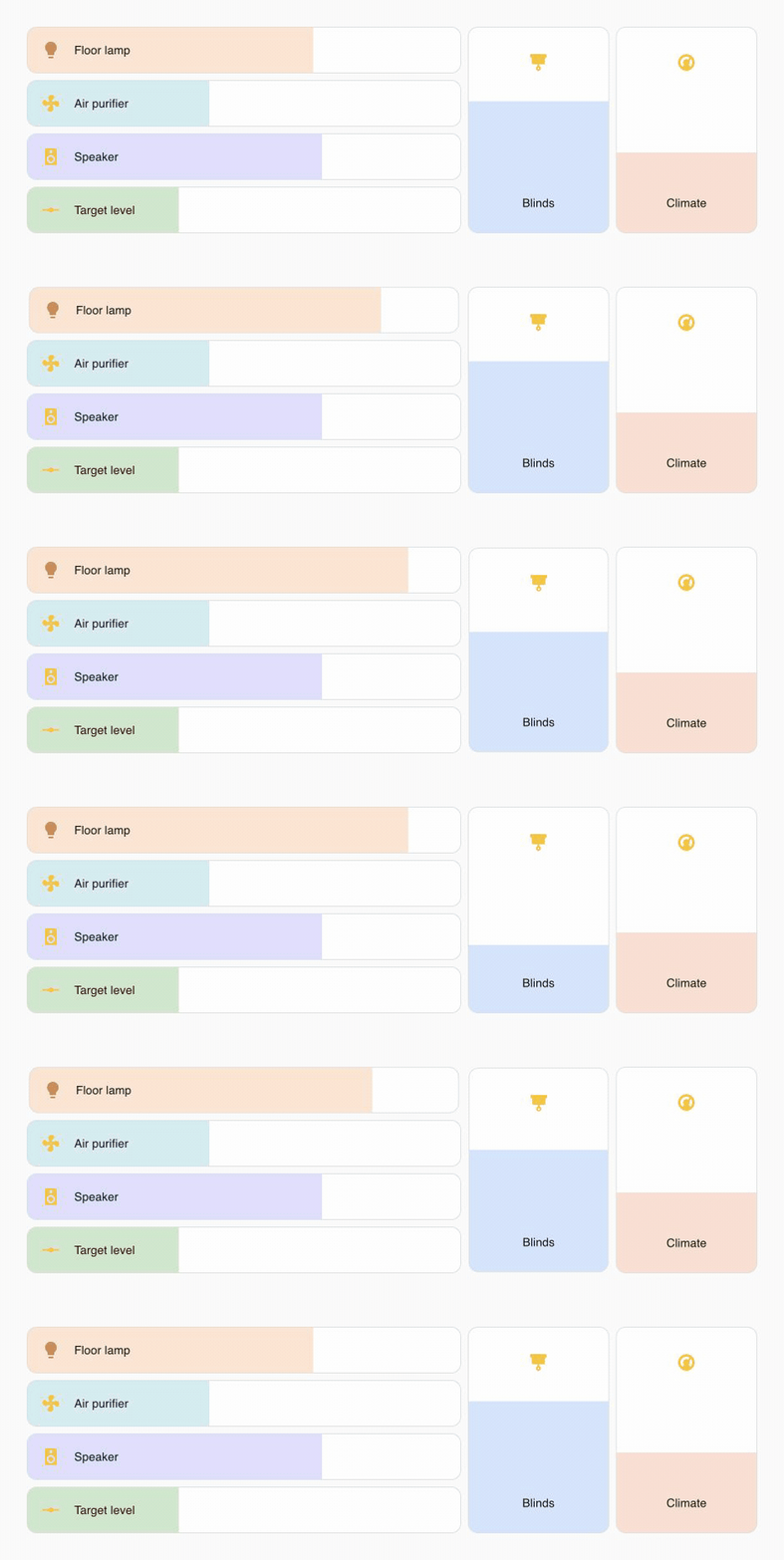
Custom apearance closer to the Home Assistant Tile card:
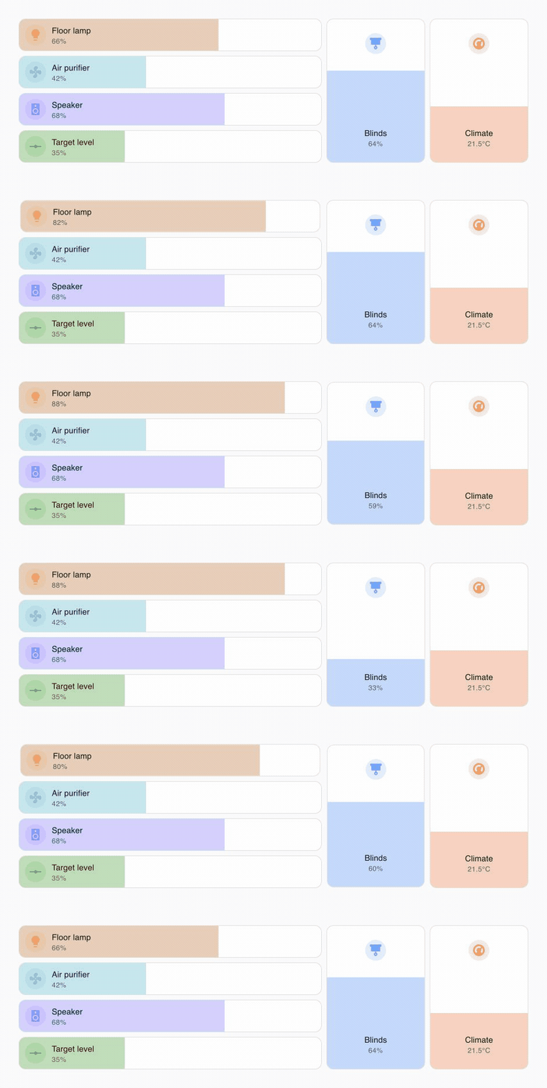
Please ⭐️ this repo if you find it useful
Installation
HACS
This card is available in HACS (Home Assistant Community Store).
Search for Big Slider Card in the Frontend section.
Manual
- Download
big-slider-card.jsfile from the latest-release. - Put
big-slider-card.jsfile into yourconfig/wwwfolder. - Go to Configuration → Lovelace Dashboards → Resources → Click Plus button → Set Url as
/local/big-slider-card.js→ Set Resource type asJavaScript Module. - Add
custom:big-slider-cardto Lovelace UI as any other card (using either editor or YAML configuration).
Configuration
Sample Minimal Configuration
type: custom:big-slider-card
entity: light.lamp
type: custom:big-slider-card
entity: cover.bedroom_blind
type: custom:big-slider-card
entity: climate.living_room
Sample Full Configuration
type: custom:big-slider-card
entity: light.lamp
name: Bedroom Lamp
attribute: brightness
transition: 0.3
height: 180
width: 60
background_color: '#a45634'
text_color: '#ffffff'
border_color: '#ff00ff'
border_radius: 4
border_style: 'dashed'
border_width: 5
icon_color: '#ff00ff'
icon_off_color: '#777777'
constant_icon_color: true
show_icon_halo: true
use_alternative_slider_color: true
icon_size: 24
icon_box_size: 36
slider_opacity: 0.3
text_size: 14
colorize: true
icon: mdi:lamp
show_percentage: true
bold_text: true
no_scale: true
no_transition_animation: true
vertical: true
min: 1
max: 80
immediate_update: true
hold_time: 600
settle_time: 3000
tap_action:
  action: more-info
hold_action:
  action: call-service
  service: light.turn_on
  data:
    entity_id: light.test_light_1
Options
| Name | Type | Requirement | Description | Default |
|---|---|---|---|---|
| type | string | Required | custom:big-slider-card |
|
| entity | string | Required | Home Assistant entity ID. | |
| name | string | Optional | Name to show on card | entity name |
| attribute | string | Optional | Capability/attribute to control | inferred by domain |
| transition | number | Optional | Transition time (seconds) | not used if unset |
| height | number/string | Optional | Card height in px or CSS length | 100%, min 56px / min 180px when vertical |
| width | number/string | Optional | Card width in px or CSS length | 100%, min 0 / min 60px when vertical |
| color | string | Optional | Slider color (CSS format) | form theme |
| background_color | string | Optional | Background color (CSS format) | form theme |
| text_color | string | Optional | Text color (CSS format) | form theme |
| icon_color | string | Optional | Icon color (CSS format) | entity color |
| icon_off_color | string | Optional | Icon color when entity is off (CSS format) | entity off color |
| constant_icon_color | boolean | Optional | Keep icon color from dimming with brightness | false |
| show_icon_halo | boolean | Optional | Show a Tile-like background halo behind the icon | false |
| use_alternative_slider_color | boolean | Optional | Use the old slider color fallback instead of Home Assistant's active color | false |
| icon_size | number/string | Optional | Icon size in px or CSS length | 24 |
| icon_box_size | number/string | Optional | Icon box size in px or CSS length | 36 |
| slider_opacity | number | Optional | Slider fill opacity from 0 to 1 |
0.3 |
| text_size | number/string | Optional | Text size in px or CSS length | theme default |
| border_color | string | Optional | Border color (CSS format) | form theme |
| border_radius | number/string | Optional | Border radius in px or CSS length | form theme |
| border_style | string | Optional | Border style (CSS format) | form theme |
| border_width | number/string | Optional | Border width in px or CSS length | form theme |
| colorize | boolean | Optional | Colorize slider using entity color | false |
| icon | string | Optional | Sets custom icon | entity icon |
| show_percentage | boolean | Optional | Show percentage under entity name | false |
| bold_text | boolean | Optional | Make text font bold | false |
| no_scale | boolean | Optional | Disable scaling the card while pressing | false |
| no_transition_animation | boolean | Optional | Disable slider, color, and icon transitions | false |
| vertical | boolean | Optional | Display the slider vertically | false |
| min | number | Optional | Minimum value for slider | 0 |
| max | number | Optional | Maximum value for slider | 100 |
| immediate_update | boolean | Optional | Update value while sliding every 300ms | false |
| min_slide_time | number | Optional | Minimum time to prevent accidental changes (ms) | 0 |
| hold_time | number | Optional | Hold gesture time (ms) | 600 |
| settle_time | number | Optional | Ignore updates after changing the value (ms) | 3000 |
| tap_action | object | Optional | Action to take on tap | action: toggle |
| hold_action | object | Optional | Action to take on hold | action: more-info |
For more info about the rest of the action options see this page: Actions - Home Assistant
Supported entities and default attributes:
| Domain | Default attribute | Service used |
|---|---|---|
light |
brightness |
light.turn_on / light.turn_off |
number |
value |
number.set_value |
input_number |
value |
input_number.set_value |
fan |
percentage |
fan.set_percentage / fan.turn_off |
cover |
position |
cover.set_cover_position |
climate |
temperature |
climate.set_temperature |
humidifier |
humidity |
humidifier.set_humidity |
water_heater |
temperature |
water_heater.set_temperature |
valve |
position |
valve.set_valve_position |
media_player |
volume |
media_player.volume_set |
Supported attributes: brightness, red, green, blue, hue, saturation, color_temp_kelvin, value, percentage, position, tilt_position, temperature, humidity, volume.
Color temperature defaults to 2200-6500 Kelvin; set min or max to override that range.
Use attribute: tilt_position for covers that support tilt, or attribute: humidity for climate entities that expose a humidity setpoint.
The card uses the following css variables for configuring the look and feel:
--bsc-background: var(--card-background-color);
--bsc-active-color: var(--state-light-on-color, var(--state-light-active-color, var(--state-active-color)));
--bsc-default-slider-color: var(--bsc-active-color);
--bsc-slider-color: var(--bsc-default-slider-color);
--bsc-slider-opacity: 0.3;
--bsc-color: var(--bsc-active-color);
--bsc-off-color: var(--state-inactive-color);
--bsc-entity-color: var(--bsc-color);
--bsc-primary-text-color: var(--primary-text-color);
--bsc-secondary-text-color: var(--secondary-text-color);
--bsc-border-color: var(--ha-card-border-color);
--bsc-border-radius: var(--ha-card-border-radius);
--bsc-border-style: var(--ha-card-border-style);
--bsc-border-width: var(--ha-card-border-width);
--bsc-icon-box-size: 36px;
--bsc-icon-size: 24px;
--bsc-icon-background: transparent;
--bsc-icon-off-background: transparent;
--bsc-text-size: var(--ha-font-size-m, 14px);
--bsc-secondary-text-size: var(--ha-font-size-s, 12px);
Testing
Run the complete local verification before committing:
npm run check
This runs strict TypeScript checks, the Vitest suite with enforced coverage thresholds, and the production build. Use npm run test:watch while developing. The same complete check runs automatically on every push and pull request.
Preview assets
The README showcase is rendered with the real card and a small Home Assistant fixture in preview/. Run npm run dev, then open /preview/?theme=light or /preview/?theme=dark. Add &variant=default for the default-appearance set, and &frame=0.25 with a value from 0 to 1 to render a deterministic animation frame.
more like this
todo-swipe-card
A specialized swipe card for todo lists in Home Assistant with custom styling
esphome_modbus_bridge
ESPHome Modbus TCP↔RTU Bridge – Transparent bridge for ESP8266/ESP32 that lets multiple Modbus TCP clients communicate…
ESPGeiger
☢️ ESP8266 / ESP32 Firmware for collecting and reporting statistics from Geiger counters